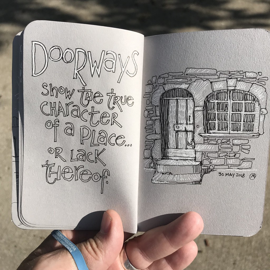
Black and White, and Grey All Over.

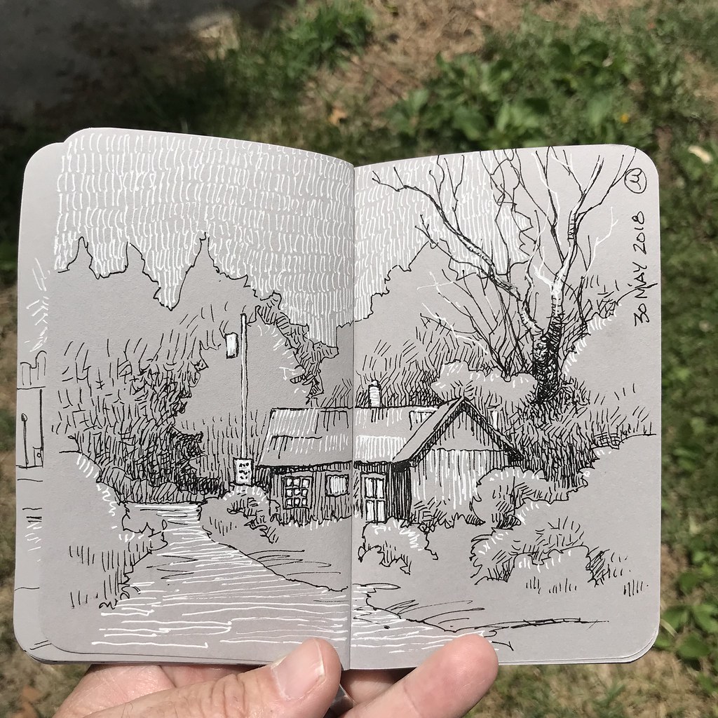
4 June, 2018. Over the past couple of days I’ve carried around two pens – my trusty Uni-Ball Deluxe and a white gel pen – and this small, pocket-size Stillman and Birn sketchbook. As always, I’m interested in seeing just how far I can push my sketches while purposefully placing limitations on myself. In this case, the limitation is range of value: black, white, grey, and the implied value created by hatching.

It’s interesting to me how different textures can be achieved by varying the strokes, as well as changing the lines into shapes.

The format of this booklet is so damn small that it does force me to consider positive and negative relationships, as well as recognizing the limitations of drawing across gutters and within the margins.

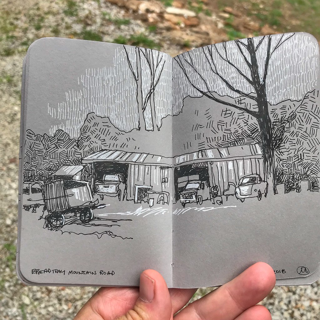
I also have to stop myself from going to far, making too many marks. Limiting the mark-making and relying on contrasts is effective. As with my choice to draw and later add a spot color to sketches, there’s a mechanical appearance when working on the grey paper that I like.

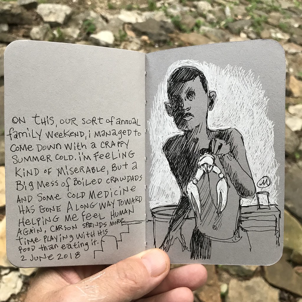
Selectively choosing which elements get the addition of white allows me to be selective about which elements get emphasized. I think there are some real storytelling opportunities working with this illustration approach, but for now it’s just me fooling around.

Brilliantly Colored Black and White

10 July, 2016. I’m riding through an older neighborhood in our small town this morning. The area is a little rundown, but not profoundly so. When the morning sun crests the roofs of the homes immediately opposite my location just enough, the porch on the house to my right simply lights up. The visual is striking enough that I’ve been compelled to stopped and photograph it several times in the past. Sooner or later I knew I would need to scribble down my impressions of the place on a piece of sketch paper. I guess today was the day to do just that.

It seems odd to describe a subject that relies almost entirely on color by using black lines to tell the visual story. But my pen is the tool readily at hand, and to be frank I’m enjoying my ride. I’m hesitant to interrupt that enjoyment for any length of time, and a brush pen makes short work of the basic composition. Meanwhile, my iPhone Notes app records my observations of color. If I decide to pursue this further then I’ll be inventive.

All of the siding everywhere on this house is a sort of medium Indian Red color that contrasts against bright white trim – everywhere except the porch. The porch is a luminous Lemon Yellow Light that glows in the morning sunlight. This morning’s sky is an intense Cobalt Blue, a color that is also reflected in the windows. The roof is a dark slate color, but it’s a warm hue rather than the very cool I typically associate with slate…perhaps a Van Dyke Brown? The shadows are warm, but I would possibly paint them with a cool cast of Quinacridone Violet. The cane chairs are Yellow Ochre, and the small sliver of grass that constitutes the front “yard” is a brilliant green which is a bit cooler than, say, Sap Green. (Liberty, Missouri. Approximately 5 x 7 inches on Aquarius II, using Pentel Pocket Brush Pen.)

Sketching via bike

31 May, 2015. I’ve passed the old Presbyterian Church hundreds of times on my bike. Although I’ve stopped on more than a couple of those rambles to sketch out the structure, I’ve never been very happy with the arrangement until now. It turns out that it’s important to create a sense of place, which I’ve previously neglected to do. I’ve also allowed the bell tower to sway me into a vertical motif. Moving to a position behind the building made me realize that the horizontal arrangement was better and more interesting.

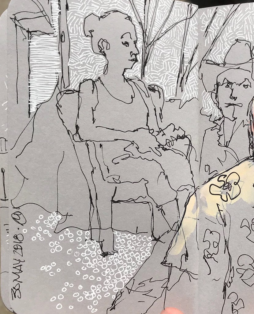
I decided to try a quick watercolor wash over the inked lines. I haven’t tried this before in the Canson sketchbook because the paper is a bit thin and, frankly, I really like how the lines lay down on the sheet. I’m a bit less than thrilled at how the pigment takes to this paper; with dedicated watercolor paper I can work with sloppy washes, spatters, and blooms of paint. The pigment comes out looking a lot like a coloring book on this paper. I doubt very much that I’ll be adding any more color to this book – at least not while I have Moleskin watercolor journals available!

Although today’s ride took me pretty far afield – just a little shy of 80 miles – I wound up doing all of my sketching in one location, literally a mile and a half from my front door. This house is located immediately across the street from the church illustrated at the top of the post. I have to say that I have really learned to love the Lamy Safari pen and the way it allows me to freely lay down lines.

Exploring a few new paths

5 April, 2015. I’ve spent a pleasant several hours exploring unfamiliar paths that dart in and out of the suburban core of the Northland in Kansas City. Last weekend I discovered this old house adjacent to one such trail, a structure quickly finding its way back to the elements! I intentionally traced my way back today so that I could do a little bike sketching here and in other spots before trekking off onto a few brand new paths. Who’d have thunk this sort of derelict house and woods would still exist amidst all the nearby new homes? (Lamy Safari medium nib in Canson sketchbook.)