All mixted up

26 July, 2015. Unfortunately, those are not field notes. I originally made the rough pencil sketch, then wandered about on foot for several more hours. Was I in Dijon at the time? Perhaps, but here I am, several weeks later, the various villages and cities all having blended together in my mind into one marvelous experience. Maybe it was Paris. Hmm. What I do recall is that I came across several other vintage bicycles that caught my eye. Later on that evening I cleaned up the rough sketch, fixing the proportions to make the contour drawing more believable. Fortunately, I’m very familiar with vintage bicycle anatomy, so that knowledge helped me to weave details into the original very rough sketch that was decidedly lacking in such detail.

As I worked up the sketch I racked my brain trying to recall what color this mixte model was. Try as I might, the only colors I could remember were those on another bike, a Thiely randonneur model. Using the Thiely as starting point, I scribbled in my color notations and set the sketchbook aside. The Thiely was a striking bike and I figured I could do far worse than to apply those colors to the unknown French step through!

So I used the distinctive yellow-green and seat tube graphic as a color guide when I finally got around to adding color yesterday afternoon. After having worked with inked line as a base drawing for quite some time, it’s been fun and different to leave the line to be defined by simply pencil marks. The sketches are less boldly drawn, and less “cartoony” looking. In some ways I think this may be a more sensitive way to represent the French locales, people, and things I have in my sketchbooks yet to be painted. (2B graphite in holder with watercolor in Canson Watercolor Journal.)

Pencil vs. Inked Lines

22 July, 2015. I’ve several pages in my sketchbooks with pencil sketches that never got inked, usually because I only had time enough to do a rough or a tight pencil. I saw this Lapierre city bike (above) in Dijon – one of the very few vintage bikes in evidence in any of the places I visited in France this year. I had to make a composite drawing, combining the bike, a guy I saw on the street, and an otherwise mundane location. The media is a simple No. 2 pencil on watercolor paper.

Getting the book out this morning, I decided to add color. Rather than ink the lines, I simply added watercolor washes and left some of the pencil lines showing.

Here’s another sketch that came back as a couple of rough pencils. Those got merged into a single composition that I now wish had included an additional element in the lower right hand corner to complete the “triangle” – I feel like it’s a good compositional strategy to have three large main shapes in the composition.

Adding inked lines to the original pencil sketch seems to have made this more cartoonish than I like. The female figure in the dark blouse is much stiffer than in the pencil, which is a shame because I like the composition. I’m tempted to re-draw the whole thing to fix that pinched expression on her face, leave out the black inked lines entirely, and keep the line work a little more subtle by leaving it in pencil.


Coming together

16 July, 2015. Every once in a while I’ll remember to capture the steps I go through in developing a sketch. I think it can be instructive to see how things come together. Presented here are the stages of sketching I’d planned to share with the participants of an urban sketching workshop I taught earlier this week. (Naturally enough, I completely forgot to share these at all!)

I often think of sketch development as three stages, the first being a rough pencil as pictured above. I keep the shapes general and usually quite a bit looser than in this example. This allows me to continue making decisions in the later stages of development.

I really look forward to the second stage, which is when I begin to ink. I like to use this stage to freely draw the lines, to make decisions about what to include and what to leave out. This is also the time I will usually add any narrative that I wish included.

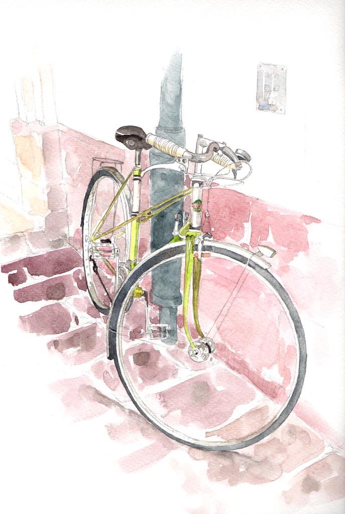
Color is the final stage – presuming I don’t leave the sketch alone as a black and white scribble. More and more I’m keeping the color simple and experimenting with splashes, blooms, and other loosely expressive blobs of pigment.

Other than demonstrating techniques, I often don’t get too much opportunity to actually do any sketching myself when I teach. This sketch was developed later on, after participants had been released to work on their own.

The workshop I’m teaching is a grad course at the Kansas City Art Institute specifically for art teachers. On the first of three days we focused on capturing people in motion. I introduced single and multiple line gesture sketch strategies along with the idea of composite figures. Thinking in terms of composite figures is a good way to avoid the frustration of people moving in and out of one’s vision too quickly, which is all to often the case when sketching on the street. Instead of focusing on one figure, the artist can combine observations of multiple figures to create one single believable figure. Although hotter than hell, participants took these ideas and worked on their own to create more comprehensively organized drawings. As usual, the first day of a new concept or approach to drawing is one that requires some confidence building strategies.

My three day workshop is divided into three areas of focus. On the first day we use the figure as a starting point to develop gestural sketches. On the second day we look at more static architectural elements. And on the third day we introduce ideas about color, which also seems to be a good time to look at foliage. Throughout it all I like to remind participants that we’re looking for a way to create a sense of place, a sense of being in, and of, a moment.

After an incredibly hot outing the first day and an equally miserable forecast for the second, we were pleasantly surprised with a cool morning breeze and cloud cover. It did nothing to alleviate the humidity, but 84 degrees beats the hell out of 100! Working at the City Market, participants enjoyed the break in weather, as well as ample seating and a subject that remained motionless.

For the third and final day, we visited a park in downtown that is located on bluffs overlooking the industrial West Bottoms, the river, and a wonderful historic residential area.

On day two I made a rough pencil of this road crew worker. I held off adding color so that I could use it to demonstrate application of watercolor wash to kick off the morning of our final day.

One nasty little surprise was discovered as I began the color demonstration. Opening my small watercolor sketchbook I found that the bottle of water in my bag had leaked and completely soaked the entire book. The sketches, other than being wrinkled, were undamaged, but I did have to take the book apart page by page, leaving them to dry out in the back of my car. Ugh.


Sketches in an extreme horizontal format

11 July, 2015. Combining sketches with my love of typography – and then in my patented lazy fashion managing to keep things a bit imprecise, I’m finding I like this coloring-book-cartoon-ish sort of drawing approach. It reminds me a little of children’s book illustration, but then I say that about a lot of stuff it turns out.

Part of the appeal is the motif: very horizontal, in a bumper sticker sort of format. I’ve tried going with an extreme vertical, as well as something closer to the Golden Mean. The elements don’t seem to have the same charm. Perhaps I like it because it feels a bit like a comic strip? Who knows? Who cares?

Chateauneuf

8 July, 2015. I’m still making scans and locating iPhone snaps of the sketches coming out of our recent foray through the regions of Alsace and Bourgogne.

I tend to sketch in layers. Usually, I’ll either go directly to ink or – as in this case – rough in gestural shapes with a graphite holder. If I plan to include a caption or text, I’ll try to design the page to accommodate those elements as I did here. A key objective for me is to keep the line work loose and fresh, and avoid overworking things. Sometimes I’m successful. I find that the Lamy Safari fountain pen has helped me to do this: the flow of ink is smooth and the lines are not spidery thin.

Loose washes of watercolor were added later, off site. (Chateauneuf, Bourgogne)

I’m torn these days. Color is attractive and adds another dimension to my sketches, but I very much feel pulled toward the simplicity of line.


Alsace and Bourgogne: A Sense of Place


“I’m not interested in the stereotype of a place, but in the essence of it as seen through one’s own experience.”

In my mind, one of the greatest of travel distractions is the snapshot. Please note that I didn’t say “camera,” but “snapshot.” Nothing lessens my enjoyment of a place faster and more surely than a carload of bedraggled tourists piling out, clicking away, chattering in frenzied excitement – yet paying almost no attention to the place at all, because they’ve made their snapshot. They’ve documentary proof of their visit to the place. And then they pile back into the vehicle, and it’s off again to the next place.

Snapshots aren’t inherently bad, but I prefer to experience a place slowly, which is why I have a tendency to do so on foot or by bicycle, unrushed. Exploring, sketchbook in hand, also tends to encourage a certain investigation of the essence of place rather than a more facile stereotype or caricature. My purpose is to communicate that essence as it is seen through my own experience, and in doing so to hopefully also communicate some overlooked truth. I will always leave out details or elements in my sketches that might divert attention; too much detail can, strangely enough, create a drawing that distorts or misrepresents the experience of one’s journey.

And yet, sometimes I find that by focusing on details rather than on the big picture, one can create a worthwhile visual conversation about a small, charming element.

Normally I will only use graphite to rough in quick gestural marks and then rely upon my Lamy Safari pen to lay down the important lines. But on occasion, as in the example above, I discover I’ve forgotten to refill the reservoir and I’m entirely without ink!

Personally, I find more satisfaction keeping the line work simple and gestural rather than going into great detail with rendering. I’ve heard this described as Zen-like. Perhaps. I rather enjoy the challenge of communicating a certain “believability” with a minimum of lines.


One nice thing about buildings in the French villages we visited is their distinctive architectural look and shape. Once one has identified the key forms, keeping the calligraphy of the lines simple and believable comes more naturally. It makes me happy to reach the state where the sketch isn’t “trying too hard” – it just is.

Alsace and Bourgogne: Drawing People

2 July, 2015. The best part of being a teacher is that June and July are travel months. The world is a great big place and I enjoy the opportunity to get out and see it, meet and chat with different people, to embrace new perspectives – and to ponder these new vistas in my sketchbook. This June we explored the regions of Alsace and Bourgogne in France, by foot and on two wheels. I filled many, many pages and will be sharing them in three segments: “People,” “Place,” and “The Direct Experience.” I begin today with “People.”

Digging into the “gallery work” of my past one will find that I focused on figural subject matter rather than a more specific genre of, say, landscape or still life or portraiture. I find myself less attracted to likenesses than I am in body language or physical expression. There’s an inherent honesty that appeals to me in finding a way to express character rather than in what often comes off as caricature. Not to put myself on the same plane as Kathe Kollwitz or Richard Diebenkorn or Marc Chagall but those are attributes that resonate for me in their work.

Richard Diebenkorn

Kathe Kollwitz

“Gallery” work is less and less important to me, and over time I’ve found myself retreating further into the rows of sketchbooks that line a couple of bookshelves. While it is true that sometimes I find a “type” comes through, I’m more interested in communicating the energy or entropy, the lassitude or élan of a person when I begin to draw them. Capturing a believable gesture communicates dynamism.

Every now and then I’ll work up sketches using a graphite stick and holder, as in the example below. It’s an easy tool tool to carry and doesn’t carry the threat of leakage, nor does one wear black smudges upon one’s hands all the livelong day as tends to happen when carrying and sketching with a pen. But sketchbook pages rub together as I bustle about a place and there is a loss of line as the drawings smudge under such duress. I also find myself worrying over details I never would bother about with a pen.

I treat my sketchbook like a sort of visual journal, often scribbling down notes or impressions that are only remotely relevant to the drawing I make on that spread.

It’s often by necessity that I wind up catching someone in a moment of stasis. Movement means your subject is fleeting and unless one is practiced in very short gesture sketches, one is entirely at the mercy of one’s rather faulty memory to make a believable drawing happen!

This is why many of my people sketches are of folks in what I refer to as the “significant pause.” It’s the moment just before or after the energy, in contemplation or on the brink of motion.

Outdoor cafes are wonderful places to sit and sketch, and enjoy a glass of wine, a cool breeze, and the surreptitious glances of fellow diners and wait staff who are universally curious to see what one is drawing!

I find that a good way to practice is to forgive oneself the necessity of rendering detail and to work with very small gestural sketches. The people in the sketch below are, perhaps, an inch or less in size. No more than fifteen seconds was devoted to any single figure. What’s very nice about this is that it tends to develop one’s ability to lay down confident looking lines. The drawings are insignificant and quick, so if one makes a mistake – no problem. Start another page or start another corner. Just keep the pen moving.