Breaking down the process

29 June, 2018. On a lark, I began to take some of the black and white sketches I’d made in situ and add after-the-fact touches of gouache. The play of flat against rendered tonality, the artifice of contrasts, and the general sense of “what the heck sort of layer is going on here?” intrigued me, and appealed to my perverse delight in perplexing others. Interest in these sketchbook pages just sort of exploded on Instagram, and I’ve fielded quite a few questions over the past two or three days. With that in mind I’m summarizing a general breakdown of the process today.

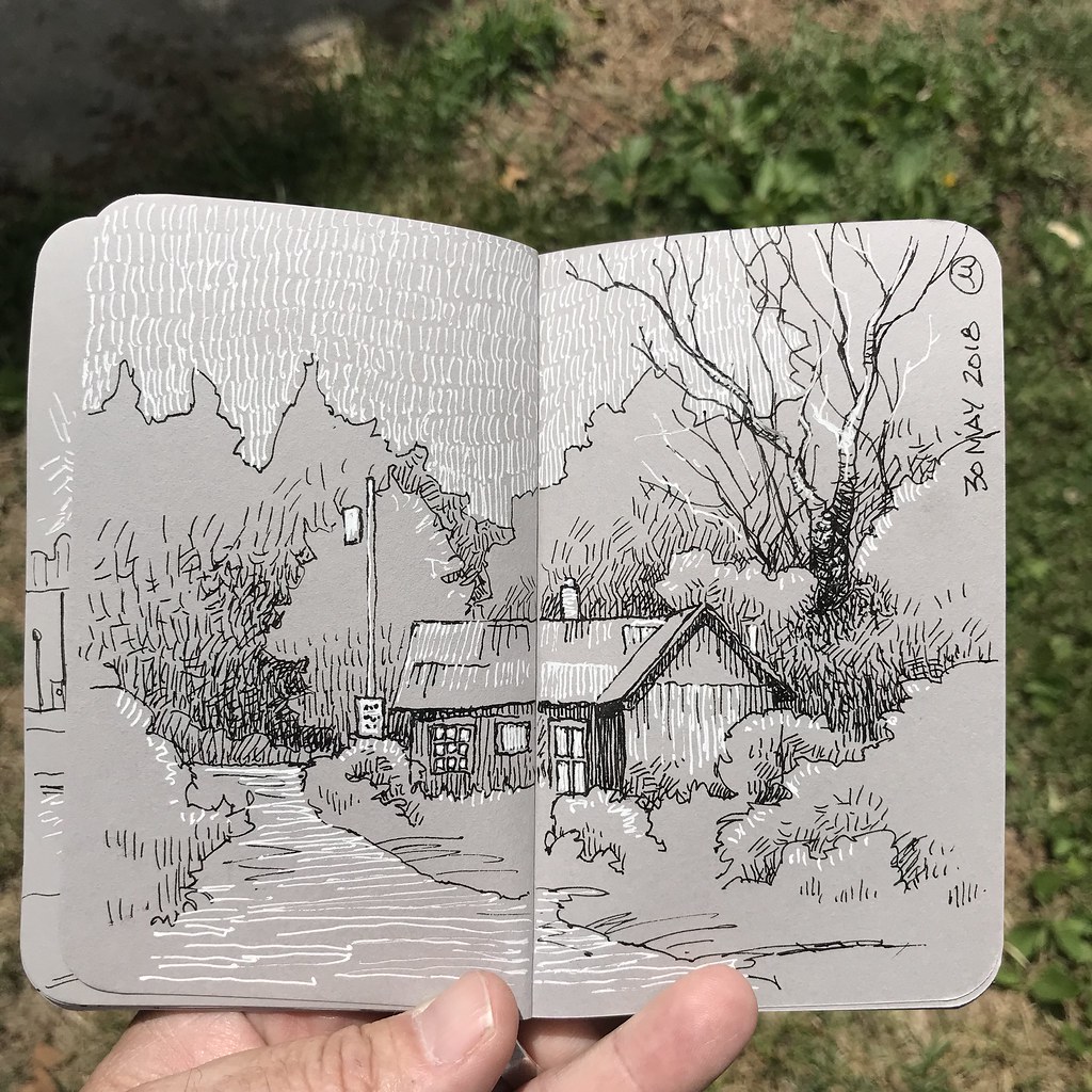
First off, it’s important to note that all of these come from life observations during my recent travel to Vermont, New Hampshire, and Martha’s Vineyard. In this example, I began by roughing in some fishermen who were finishing up their day, pulled up to the pier in Menemsha Harbor on Martha’s Vineyard. Something I very seldom do is use a pencil to make a light construction drawing – usually, I just work directly with a pen and trust my instincts. But as you’ll note, I did use a pencil not only on this sketch but on all of the others in this post as well. The advantage, I suppose, is that it provides one with the flexibility to do the graphite drawing in situ, and embellish with ink, paint, or whatever later on. In fact, I began the inked lines in the field and finished them later on – frankly, I wasn’t convinced that I had a decent composition to work with. I nearly abandoned things at this point.

Later on, the contour lines inked, I blocked in the water entirely in black using a Pitt marker which is loaded with India ink. This is a compositional device, and it helps me to make a graphic statement, as well as establish points of emphasis. The contrast is a favorite tool of mine, but in this case I still wasn’t convinced the sketch had anywhere to go. I began to reconsider what elements I’d initially chosen to emphasize.
And here we are: Trying to maintain a visual flow with points of emphasis that are roughly triangular in shape, I’ve woven in spots of color. I’m using gouache because it is opaque enough to cover the gray-toned ground of the paper. It’s also matte, like the surface of the paper, so they mesh well, visually. Areas such as the top of the posts and the type get hit with a white gel pen – I rather like how that tends to pop off the gray tone of the Stillman & Birn sketchbook paper. The posts, by the way, bothered me left in the gray of the paper, so I changed them to a pattern of inked lines and decided I really hated that look. I’m much happier having used the black India ink to silhouette them. Notice that the water, which had been similarly silhouetted earlier in the process, has had a layer of gouache added, impacting the previous compositional decisions so that the visual structure is more interesting.

In Hanover, New Hampshire, on the Dartmouth campus, rain began to fall and I sheltered under one of the huge trees lining the streets there. At the corner, one pedestrian was so engrossed in something on his iPhone that he missed not one, but three crossing lights! It’s not often that I get a street subject to stand still for any length of time; realizing what was happening I quickly penciled in the basics of his figure. (I had to sort of guess at the umbrella after he’d wandered across the road.) Leaning against a tree trunk I penciled in the truck and some indications of environment, then inked the contour lines while I waited out the shower.

The same process applies here. I’m especially happy with the leading lines that make this compositional design work. The lettering, once again, was filled in with the white gel pen, as were a couple of the flourishes: the boat in the background and the highlighted edges of the plastic containers. As with all of these examples, the gouache was not added in the field, but much later on.

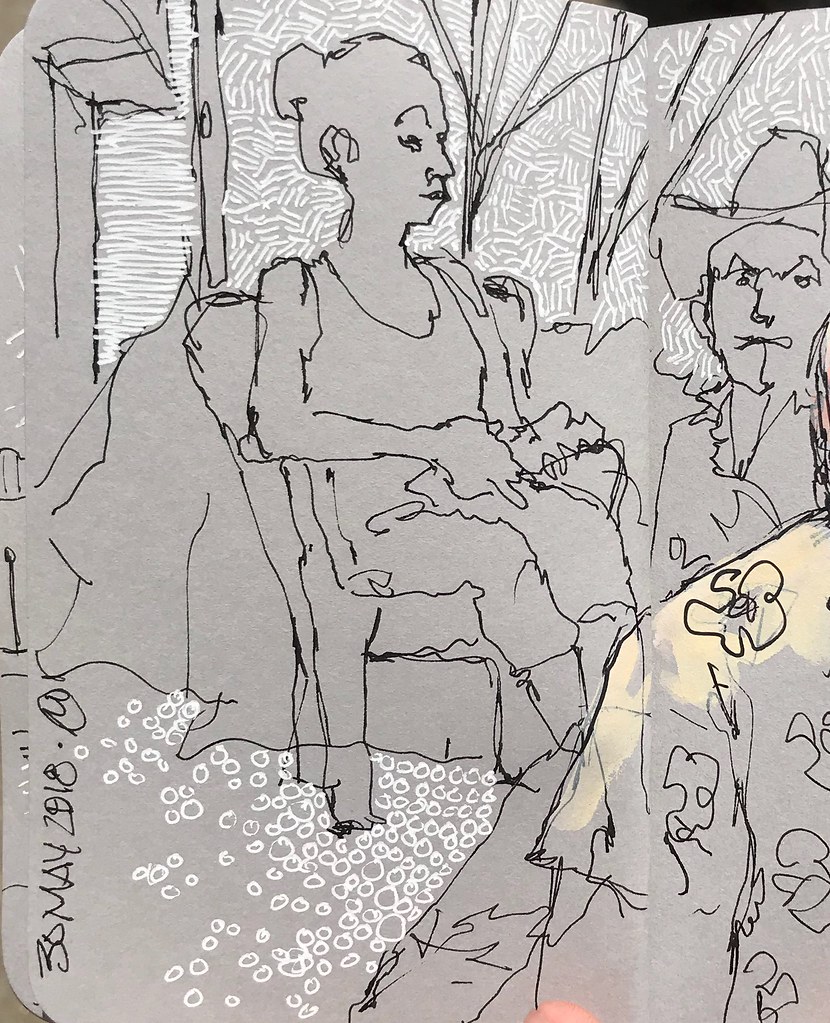
For this sketch, made during lunch in Edgartown, I used my Kuretake No. 40 brush pen rather than a Uni-Ball. I’m not certain, but I think this may have been the only time I used that particular drawing tool on this trip… when things are working for me, I tend to stick with them. The ladies sitting at the bar were easy subjects for the duration of my meal (which, by the by, included the first $20 hamburger I’ve ever eaten.) This was actually the first gouache experiment I made in my sketchbook. The drawing was nice but felt empty somehow. What, I asked myself, would be the worst that could happen if I added touches of gouache over the linework? Would it get too “cartoon-y?”
That experiment led to the series I’m currently working on. Meanwhile, I’m also developing some straight plein-air work with gouache. It’s just a gouache sort of time for me, I suppose.
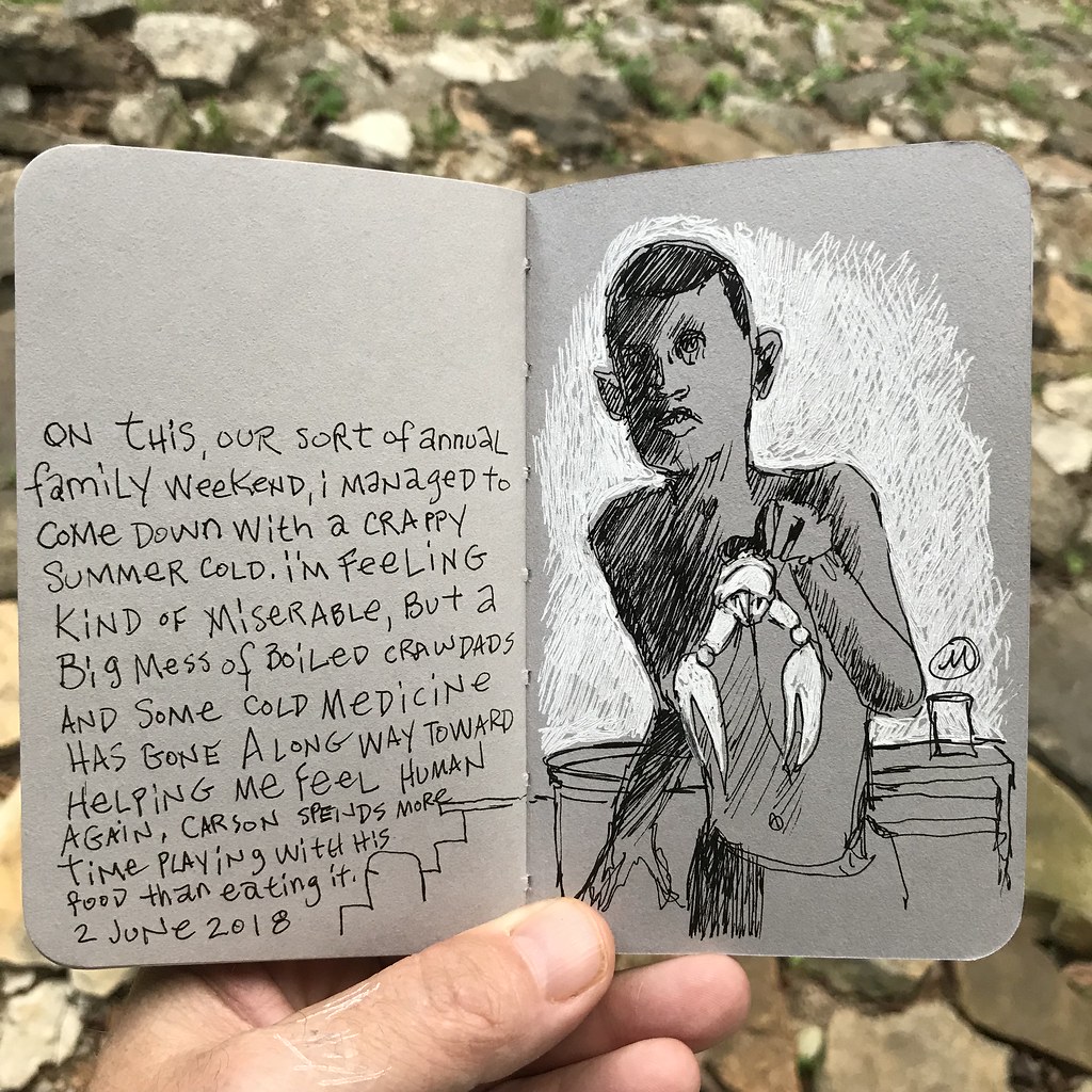
Final note here: I want to point out that despite the emphasis on technique in this blog posting, what’s most important to me than anything else, and what works for me in all of these is a sense of story. I’m interested in making sketches that communicate some narrative component and I’m happy that one can look at these sketches and ask, “What’s going on here?” When that happens I feel that my efforts have been successful.