Small Town Car Show

29 April, 2018. I find it interesting the kinds of events that draw like-minded crowds of people together into one place. Homes shows, flower shows, comic and sci-fi conventions – and certainly car shows. They all bring out the enthusiasts.

Although I toyed around with British car restorations years ago, I know just enough about cars to be dangerous. I don’t have much in the way of institutional knowledge, nor was my dad successful in passing along familial engine knowledge. Mechanically, I can usually blunder through and figure things out. This is probably why I enjoy the challenge of bicycle restorations and mechanics over the arcane wizardry of motors. What draws me to cars is the aesthetics, the design choices made popular in one era over another. I love chrome and “sleekness.” Only a few American cars were characteristically “sleek,” though. Riding through the Liberty Square yesterday, I encountered an unusual traffic backup. The town square is off the heavily trafficked six lane roads that have become our “main” routes through town, so more than one or two cars waiting at a stop sign means there’s an event happening around the old courthouse building.

And so it was.

The diagonal parking on all four sides of the block and on both sides of the street was filled with vintage cars, the babied products of the local car club. Mostly muscle cars from the fifties, sixties, and early seventies, there were also a few examples from earlier “classic” eras. More than a few had morphed into hot rods, like the example I sketched above. I am not sure what it began life as, but it rumbled through life now as a hot rod chop. Not really my cup of tea, but it’s a cool thing all the same. And others clearly felt the same: it was getting a lot of attention, especially from guys about fifteen years my senior, gents who were very likely rodding old hulks as sixteen year olds in the late fifties.

Drawn with a Uni-Ball Deluxe in a Canson 180 sketchbook; page size is approximately 5 x 8 inches.

Feelin’ the Zorn

24 April, 2018. A couple days ago I mentioned that I planned to try out the Zorn Palette on a couple of these 4 x 3 inch gouache studies I’ve been plowing through for the 100 day creativity challenge. As of this writing, I’ve made a couple of attempts, the first of which is illustrated above.

The Zorn Palette is a limited paint group: Ivory Black, Yellow Ochre, a mixing white, and Cadmium Red Medium. Well, just like when I cook it took me all of about two minutes before I changed the recipe. Instead of Cad Red (which I don’t happen to own a tube of in gouache), Scarlet Lake was substituted. It makes a difference when mixing with blue hues, but as you may notice there’s no blue in this color grouping. Ivory Black has cool characteristics and substitutes in a very restrained, but harmonious, way for the blue corner of the color triad. Mixed with Yellow Ochre, some nice greenish toned mixes are possible.

I like limited palettes and have experimented extensively with various versions of the triad. In watercolor, my kit usually has a cool and a warm blue, red, and yellow, with a green for mixing earth tones. Many of my friends have commented on how few colors I carry – so imagine a kit of only four opaque paints! I confess that it felt very discomforting trying to rethink the color organization of what I was observing, and translating those into the limited color range of the Zorn Palette.

But stepping back, allowing a little time to pass and a little distance from the painted image… I rather like the subtle color range.

Urban Exploration

22 April, 2018. It’s a two-post day today. Earlier I shared some of the gouache studies I’ve made for my 100 day project. Now, it’s time to share a few urban sketches.

I’m told this Art Deco structure (above) won’t be around much longer and I was encouraged to document it while it was still possible to do so. I decided to start with this quick contemporaneous sketch of the location. There’s another, perhaps slightly more interesting facade on the east facing elevation. I’ve begun to pencil that in with greater detail and precision. I’ll need to revisit the location again to block in color.

It’s a very interesting neighborhood and it makes me wonder what this place looked like in its heyday.

Finished scouting for the day, I was driving back north. I’d only gone a few blocks when I encountered this interesting cluster of buildings. The looming silhouettes intrigued me most of all. Pulling over for a few minutes, I grabbed a pen and I decided that maybe I wasn’t finished scouting after all.

As it turned out, the silhouette of downtown Kansas City also caught my eye and I had to find a stopping point to block it in. The color was added at home as my perch was a bit precarious… that may explain my hurried caption which should more correctly state that this is a view of the city facing west.

A few days later, and a few hundred miles south, I found myself wandering around some of the towns in Northwestern Arkansas. I don’t know if this was the first Saturday morning market of the season or if it’s always such a thriving spot each week, but the Bentonville Square was bustling with activity. On two of the corners, young boys were playing fiddles, busking. Bread, chocolate, vegetables, arts and crafts – everything was there and in abundance.

A lot of the time my sketches are composites. People move around and I draw what happens to be in front of me at the moment: It’s an organic process and I enjoy the challenge of not only sketching, but also looking for observable elements that can turn a scribble into an interesting composition. This sketch is one of those organic composites in which serendipitously the various people I drew seemed to be engaged in conversation. When I noticed this was happening I looked around for an interesting structural element to add to the scene… the Tyson’s sign fit the bill quite nicely!

This guy had a long white beard. He was quite stocky and, frankly, looked like a pretty rough character. The tiny little dog that he was walking lent a less formidable character to his persona.


Rockin’ the Challenge

22 April, 2018. The 100 Day Project continues and I’m proud of myself for not giving in to impatience. I think the secret to avoiding the tedium of a long term challenge has been to work small. The 4 x 3 inch format that I arbitrarily chose lets me get lost in the work, and then emerge somewhat triumphantly energized to start another.

I began this challenge working from a couple of vacation photos. As my confidence with the gouache medium began to grow I started to take liberties with each new image.

The 4 x 3 inch format allows me to set up six to a page. With several on a single page, it’s easy to compare what I’m doing with what I’ve done. I find myself constantly evaluating whether I’m growing and learning.

This one has a sort of Cezanne thing going on – not a consciously intentional gesture or homage, I assure you! It just sort of happened. It’s also very “watercolor-ish” and has some transparent glazes that are apparent, rather than the more characteristic opacity of gouache. I have greater difficulty getting opaque colors when reactivating dry paint on the palette than I do when I work with paint freshly squeezed from the tube.

Although the forms are rather cartoonish, I’m pleased with the vibrancy of the warms against the cools.

I’m starting to hit my stride in this piece. The water is absolutely opaque but “feels” transparent.

The problem with doing a daily challenge is that some days there’s little opportunity to continue working on what has turned into a series. I was in the classroom with students, teaching the use – of all things – gouache. This apple was the result of my work on that day.

My confidence has begun to get to the point that I felt I could be heading outdoors to paint on location. This little one was the second of three plein air pieces I’ve generated in gouache over the past couple days. Notice that I blocked in the main shapes with pencil, which is still evident in the thinnest areas of paint application. One of my goals is to move beyond the need for pencil. Which leads me to…


… this plein air piece. No pencil, just several layers of applied paint, and the first piece that feels to me like I’m heading in the direction I’d like to see this 100 day experiment go. Next up: a plein air experiment with the so called Zorn palette – Ivory Black, Cadmium Red, Yellow Ochre, and White.

(Not really) Sweating the Small Stuff

14 April, 2018. Art making is really the same thing as “choice making.” You make, for instance, a conscious decision to mix particular colors together or to place a certain mark  in a certain place on a certain surface. I think “choice making” is what it is about “art making” that is satisfying. For me, personally, there is a reward in knowing when the decisions I make have resulted in a visual or technique that brings me joy.

That’s the neat little surprise I found upon entering into this internal pact I made with myself to pursue a 100 day project. To slightly digress, my idea was to increase my comfort using gouache by making a 4 x 3 inch sketch every day for 100 consecutive days. I’d focus on application and selection of color, as well as simplicity of shapes.


The “surprise,” if you will, comes around each time I begin a new small composition. The 4 x 3 inch format really forces me to make very intentional decisions about size, placement, and shape. Every time I stroke the surface with my brush, it’s a very intentional act. I immediately realize how lazy I can be with larger paintings: short cuts are often deliberate – and appropriate – but, sometimes they simply come off as laziness.

These small paintings engage me in the composition and help me to recognize which shapes are important and which can simply be ignored. With each passing day I am finding that brushstrokes can be used to create greater visual meaning. Deliberate placement and scaling is taking on the graphic characteristics that I prefer to employ.

I’m a big believer in asymmetry, as well as finding ways to design a composition with a “visual triangle.” By that I mean that three visual points are established by emphasizing carefully considered subject elements or areas of contrast that draw the viewers eye around the composition in a somewhat triangular path. Sometimes this is very obvious and other times not so much – but I always make the attempt to do so.

I think it’s easier to plot a composition in a small sketch than it is to just leap into a larger work. Could be that I’m rebelling against so many years of designing big painting. I certainly enjoy the immediacy of sketchbook work and small paintings. I’m still in search of an energetic brush stroke in gouache to compliment the loose calligraphy of lines I relish in ink drawings.

100 Days

10 April, 2018. Just to be clear about a couple of things right off the bat:

  1. Neither of these sketches is either a plein air study or an urban sketch. They were both made by looking at old vacation photos.
  2. I only dibble dabble with gouache.

The thing is, I’d like to be a better practitioner of gouache. Once upon a time I was pretty handy with oils. I quit because the requisite solvents made me nervous. I feel like gouache might be a way to revisit the way I once painted in oil – thickly, and with a certain degree of abandon.

So I made a commitment to improving by jumping on the “100 Day Challenge” band wagon: I will make one 4 x 3 inch gouache study every day for the next one hundred days. Furthermore, I’ll focus on color and shape; given the small format, that’s probably a wise restriction on my part.

Oh, and I’ll do this without giving up any of my “being there” pen and brush urban sketcher drawings.

The timing is good for me – I just introduced my drawing students to gouache. So, for at least the next couple of weeks it will be appropriate for me to paint alongside them in the same media. They’re working from photo references and as much as I chafe at doing so myself, it is a good way to get in the practice.

Art making in a rural community

7 April, 2018. I was recently asked to contribute a small sketch to an exhibition. I get a lot of requests of this nature, so the invitation in and of itself wasn’t remarkable. What was unusual was that the request came from a student in a small, rural high school, a young lady interested in the role art plays in communities such as hers. Having graduated from a small town high school myself, it got me thinking.

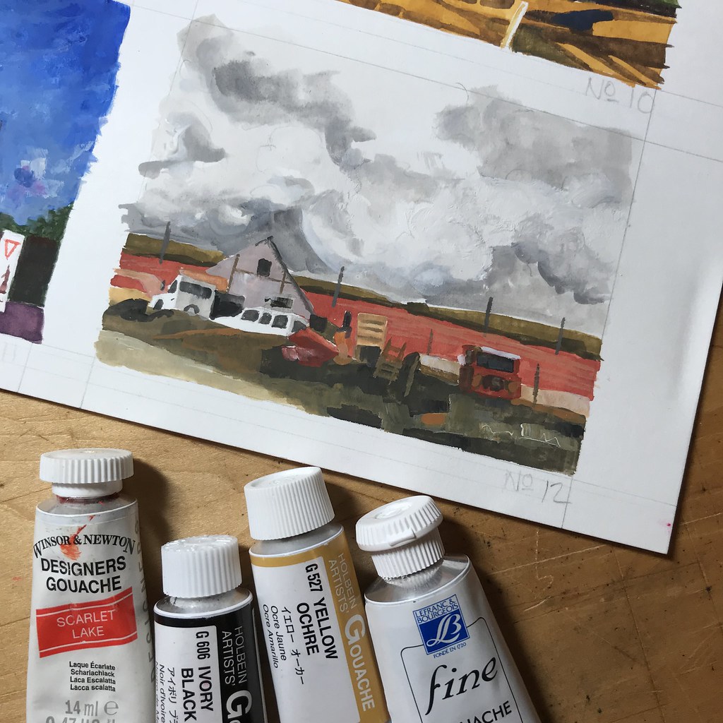
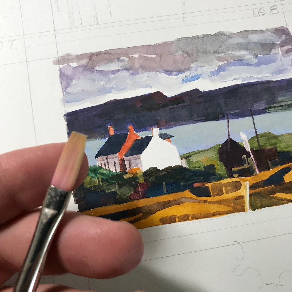
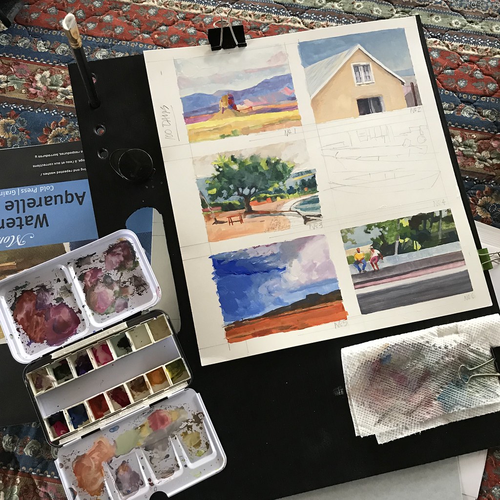
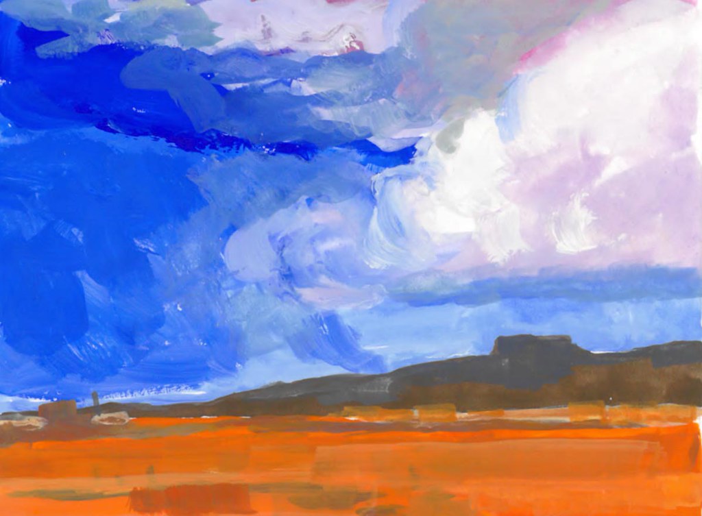
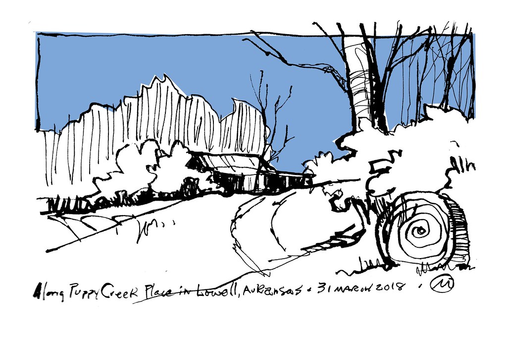
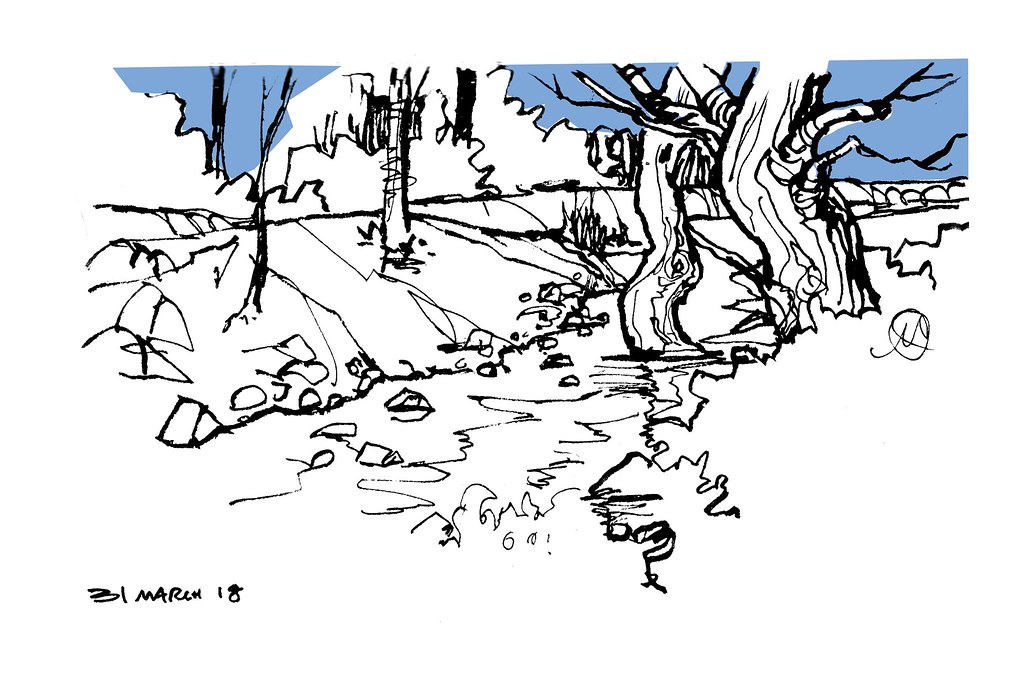
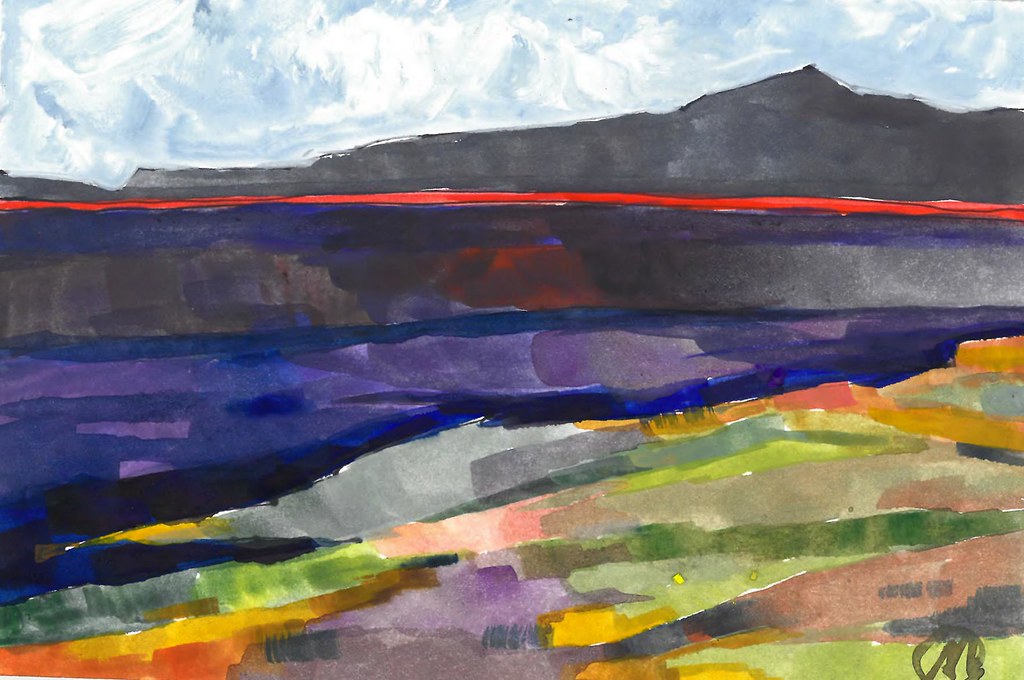
The small sketch I sent to her was painted on a 4 x 6 inch piece of illustration board that she provided to each exhibitor. I explained that mine was a quick sketch using gouache to represent a rural landscape I’d recently encountered. I’m an avid cyclist; it’s not unusual for me to take off with no set destination in mind, only to discover hours later that I’m on a paved country road sixty miles from home. I carry sketching supplies with me when I ride, and my little sketch began life as a quickly scribbled pen drawing of a recently burnt field. I’m sure this practice is common in other places as well – in the Midwest, one will often come upon a soot-blackened field in the early Spring months: one good rain later, and the field turns into a blanket of fresh greens. My colors were added later on: I built up a couple of layers of loosely blocked in hues and explained to her that I was using gouache, which is an opaque watercolor media. My work is usually very loose with a lively approach to line work, but I like to play and experiment. This sketch is an example of that sort of artistic play and reinterpretation of a scene.

Rural communities. I think the internet and social media make it much easier today for artists in rural communities to be part of the “outside world.” About a year ago I began to interview artists from around the world for Drawing Attention, the official magazine of Urban Sketchers. Despite what the name may imply with the word “urban” in the title, many of the artists I write about live and work in very remote areas. Facebook, Instagram, Flickr, Etsy – among many other platforms – provide a means for artists to “shrink” the world down to a manageable size. I’ve often wondered if nineteenth century artists might not have been very envious of our twenty-first century connectivity!

Artist recognition in rural areas. Many art makers seek out validation. It’s tough to create art; we often question ourselves and our abilities, and young artists in particular need encouragement – confirmation that what we do is worth the act of doing it. I was asked about artist recognition as it relates to rural art makers. The question seemed to imply that the environment might be a more limited one in terms of artist recognition, and I suppose there may be truth in that presumption. I responded that artists living in rural areas might consider engaging in public art projects in order to generate visibility. In my home of Liberty, Missouri the community recently hired a mural artist from someplace in Iowa to create a very large artwork on the town square. It occurred to me that community organizations might be a key: community theatre provides a valid means of artistic expression for those who wish to perform, as does community orchestras and choirs – why not create a sketching group? Making art doesn’t have to be limited to the “professionals” (whatever that actually means these days.) Community engagement could mean that everyone is invited to participate, regardless of one’s ability.

I come from a rural community of about 2,000 residents, Slater, Missouri. In a place this small, if you can draw you are automatically identified as “the artist.” My pathway in the 1970’s was to leave town, go to university, and begin a career as a designer and illustrator. Finding an audience was easy for me: I learned to talk intelligently, to listen to my client, and to logically solve the visual problems that confronted them in their advertising or publishing needs. When you can meet those conditions, your audience tends to find you. That also eventually led to me understanding that others could benefit from what I learned. Thus, I moved from practitioner to teacher nearly twenty years ago, but my personal accomplishments came about after “leaving for the big city.” It seems to me that some feel this is the only legitimate pathway toward artist recognition.

I’m not totally on board with the idea that “recognition” should be the end goal for an artist. I feel that an artist has a need to communicate and share. If one’s message resonates, recognition might follow. But I am aware of many people who have achieved recognition, yet accomplished very little. Those priorities seem to be switched to me: accomplish first. Is making art your vocation or your avocation? Do you make art to make a living? Or to make life more enjoyable? In the end, I often feel like my response to questions raises even more questions than I answer.

And maybe that’s what it means to be an art maker, regardless of where it is you happen to call home.

Staying Loose with Fude-tipped Pens


1 April, 2018. Harry’s is a bar I haven’t visited for ages and ages… decades, in fact, to be completely accurate. But I recently discovered that a sketch group gathers here on Thursday evenings, so I’ve come down to enjoy a libation or two and meet up with what has turned out to be a diverse group of sketchers.

The bar is quiet and on a Thursday is not especially crowded, so it’s easy to collage together a couple of subjects into a single drawing. My sketches often emerge organically.  I’ll begin by sketching some detail that catches my attention and then allow the drawing to grow out of that. Sometimes, as in this instance, two sketches on facing pages grow toward each other, overlap, and then become one. As I realize this is taking place I will begin to find lines or shapes that have common ending points to allow a collage of imagery to take place.

The following morning I had to pull over on my way to work. The full moon seemed huge in the darkness before sunrise, the pumpkin color was incredibly striking. The sketch itself took a minute or less on a loose piece of copy paper that was conveniently sticking out of my brief case. Like all of the sketches in this post, it was quickly scrawled using a Fude tip fountain pen – the two above were made with a Duke, those below were lined with a Sailer. Although the Duke seems to have a smoother ink flow, there is otherwise little difference between the line quality of these pens.

There was a time when I would not have so readily embraced the graphic line quality of a sketch such as this one, nor the mechanically flat spot color. I’ve come to appreciate the nature of such mark-making though. In some ways the strokes are rudimentary, yet at the same time I find they can also feel quite meaningful.

Lots of thick lines with a few thin marks add a little visual interest, and the tiniest bit of visual texture. I enjoy the fluidity that the heavier lines have, which is made possible with a comfortable hand position when using the Fude-tipped pens.

Our server that evening was intrigued that I would dine and sketch at the same time. After sharing that this is common for me, she exclaimed, “Draw me!” But after I pointed out that she’d need to stay near for a few minutes it was decided that her manager probably wouldn’t appreciate that sort of table attention. As a consolation, she pointed at the next table over and said “OK, draw him instead.” So I did.