Making it up as I go.

30 April, 2016. A few years ago I discovered Urban Sketchers. The idea of a sketchbook, drawing out on location, and recording what one sees appealed to me and, indeed, aligned well with the direction I’d been heading for quite some time. I’m not a committed enough plein air painter to work that way exclusively, but carrying a pen and sketchbook pretty much anywhere meets my artistic needs very well.

And so I embraced Urban Sketchers – for a while. I taught urban sketching workshops. And I became an admin for the organization. But it was all a bit unsettling: Any time a group solidifies, codifies, and forms rules, members of the group are bound by limitations. Urban sketching embodies for me many charming characteristics of sketching, but rules… Those damn rules! They take the enjoyment away from sketching. I found myself placing restrictions upon what I would be drawing, attempting to quantify if any given page in my sketchbook “was” or “was not” an urban sketch. That sort of philosophical approach is simply too taxing, and takes me away from living in the moment – which, after all, is the truth of sketching.

I unapologetically live in the moment when I’m sketching. I make things up as I go along. Hell, I make things up, period. These drawings, scrawled out upon page after page, book after filled book, are composites of many things observed, impressions of a place, a person, a thing. They are not accurate by any means, sometimes leaning toward caricature and other times towards some ideal I have in the back of my head. Often, I’m simply inventing as I go along.

The drawing above is one such example of this approach. It’s a conglomeration of people who moved in and then out of my field of view at the local pub last night. The only “truth” is what I make of the sketch, so it’s pretty far from the “reportage” Urban Sketchers philosophically seeks out.

I feel the desire to objectively communicate the observed world is a lost cause in the first place. As visual people, we are constantly making decisions about what to include or exclude from a drawing or photograph. When one crops an image for instance, one is editing and thus interpreting the world, rather than accurately reproducing it. And heck, that’s a whole lot more interesting in the first place.

So the rules I choose to enforce are seldom those artificial ones binding me to a group, or that leave me apologetic about the subject I’ve drawn or the way I choose to go about sketching it. I make mine up as I go along, learning from my experiences what works and what does not, what I enjoy drawing and moving on when that subject begins to bore me.

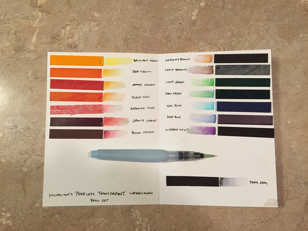
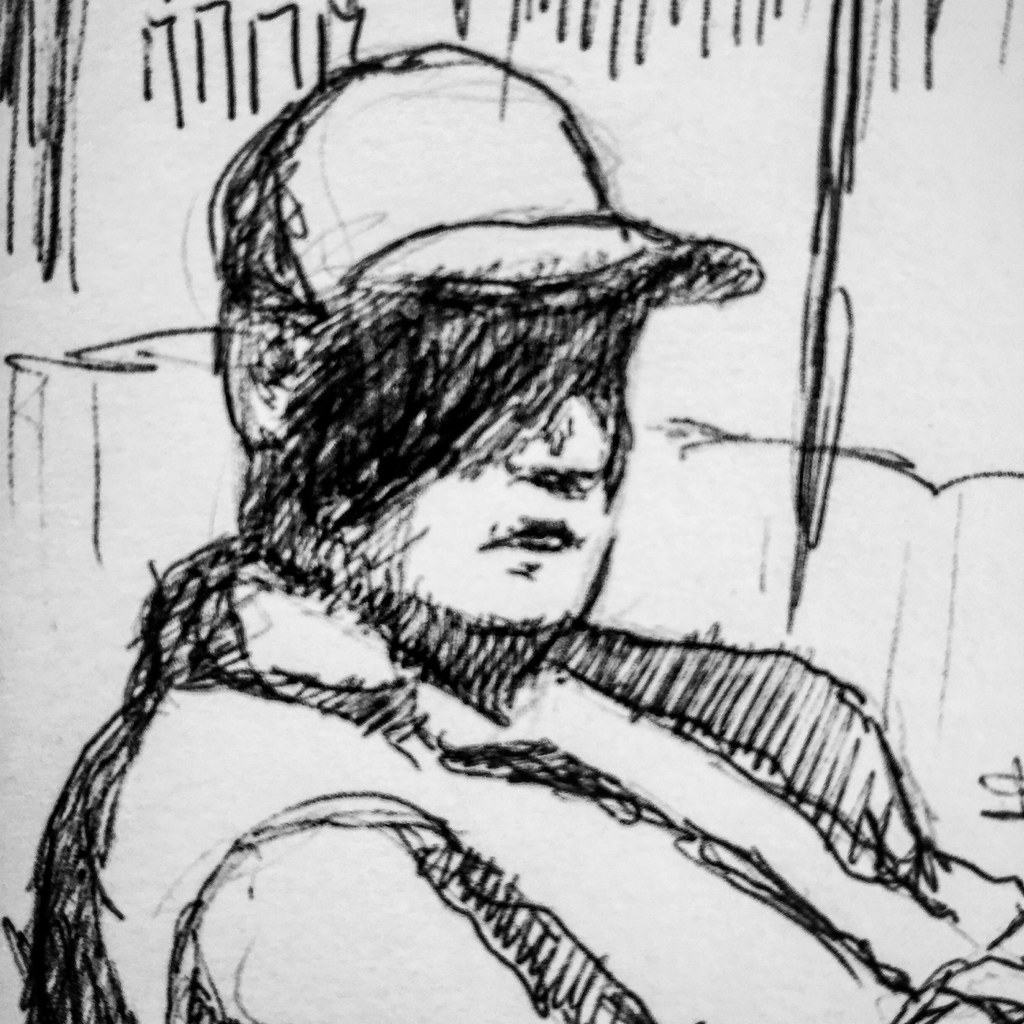
Brush pens seem to be moving in and out of my wheel house these days. The Pentel Pocket brush pen has come in pretty handy, but I find that if I carry it exclusively I miss that which I find most comfortable: My Lamy Safari medium nib fountain pen. Some months back, I purchased a Kuretake No. 40 Fountain Hair Brush Pen because I was intrigued by the idea of a loaded pen that sports a nib of sable, rather than the synthetic points on other pens. The sketch above is of a guy who passed me in the River Market. He was in my line of sight so briefly that I’m afraid my pencil lacked a lot of detail. Laying in inked lines later resulted in a whole lot more intimidating fella than the man who passed me on 4th Street! But not having a lot invested in the pencil meant I could be free to play around with the drawing, and seemed a worthy place for an initial testing of the Kuretake.

I found the line to lay down smoothly, but not as fluidly as a fully charged Pentel Pocket brush pen. I need to continue to work with the pen before passing judgment however, because it could very well be that it needs time to get fully charged. A very nice characteristic is the ability to create dry brush marks, to scumble, and to achieve some degree of grayscale tonality. The line is very calligraphic and will take practice to get the “touch” and figure out the sweet spot of how to hold it, and the amount of pressure to use when drawing. First impression is that I like it.

I used the Kuretake to block in line work in the sketch on the left. It took to the Fabriano Artistico HP watercolor paper I was using for the test nicely, and without skipping. Despite hearing that the cartridge ink is water soluble, I had no problem at all placing washes of color over the lines without reactivation of the ink. On the right is an initial test of a Sakura Koi water brush pen. It handles pretty much exactly as does my Niji pens, so I don’t see an advantage to one over the other. In addition to the round, I also now have a flat water brush. To be honest, I seldom use a flat brush so it’s difficult to say yet whether this will be useful.

The other “plunge” I’ve made is to order a Stillman and Birn sketchbook. I am very content with the Canson 180 book and paper, and I don’t plan to abandon my very worthy companion. When I wish to work in color, I’ve got the handmade “mini” sketch pamphlets I’ve made from Fabriano Artistico HP. But I’ve been curious about the Stillman and Birn books simply because so many sketchers seem to swear by them. It’s a bit incongruous that a book so popular isn’t carried by any of the local professional art stores in my city, forcing me to order one online if I wanted to satisfy my curiosity! I’ve done so, it’s in the back of my car, and I’ll try it out as the urge hits me.

Because after all, I’m just making this up as I go.


Catch as catch can.

23 April, 2016. We drove up to Omaha for a weekend getaway and I figured I’d have plenty of opportunity for sketching. However, having the grandsons along meant the free time I thought I’d have was actually pretty limited and I had to grab whatever sketching I could, whenever I could. It turned out to be a game of catch as catch can. (Lamy Safari Medium Nib)

Busted!

16 April, 2016. I used to be a heck of a lot more discreet when I sketched in public. It’s not that I mind people looking over my shoulder while I draw. Usually the casual observer has pretty much the same comments: Did you draw that yourself? I can’t draw a straight line. That looks like fun. I wish I could draw. The conversation never ends there, and that’s fine: people are curious and I don’t mind sharing.

But I have always tried to sketch people from a distance without intruding upon their space. I don’t want anyone to feel any discomfort from my artistic voyeurism, and I sure don’t want to be looked upon as some sort of stalker either! I’ve learned how to draw without drawing attention to myself and I used to be quite good at it. Here lately, however, I’ve been busted on numerous occasions, “made” by people I’ve been drawing.

The sketch above, for example, like many of my scribbles is a conglomeration of people and places. I fill the page, creating a compositional arrangement as opportunity permits. Since people are constantly in motion, each person is often a collage of parts: one guy’s head fuses to another’s torso; suddenly he has a companion in my drawing that he didn’t have in real life. I was quickly adding the woman onto the sketchbook spread when she spotted me drawing and made a beeline in my direction. The first words out of her mouth as she bent over my sketchbook was “That’s not my husband, you know.” Followed by: “That looks like fun. I wish I could draw.” We chatted for a few minutes. I was pleased that she immediately recognized herself in the drawing, I provided my usual background information: Yes, I’m a professional artist. Yes, I’m an art teacher. Yes, I’ve been an artist my entire life. Why yes, it is fun.

Sometimes the encounters are more awkward. In the DMV this week, while waiting my turn to be served, I began to sketch the people around me, also waiting on benches and demonstrating varying degrees of patience. Midway through the quick scribble above, the young lady popped out of her seat, walked directly to me and sat down next to me. We were immediately far more cozy than I was comfortable with! I find it a little intimidating when strangers so egregiously violate my personal space: leaning in, laying a hand on my arm to chat – and all quite dauntless and innocent. Although quite a pleasant little chat, I was relieved to escape as they called my number to the counter!

The gentleman in the lower corner seemed to only gradually develop an awareness of being my subject. He was intently searching through his cell phone for something and when he finally got up and wandered off, I sat and continued drawing from memory. A few minutes later I sensed – rather than saw – a presence. I’m not certain how long he’d been standing behind me as I drew. “Hmpf,” was all he said before turning on his heels and disappearing into the market crowd.

This market shopper paced back and forth for quite a while in generally the same area, perusing generally the same produce. I was pleased to be able to make three sketches of her because under normal circumstances people I target don’t stick around long enough to generate a legitimate likeness. After perusing the same box of squash for about the fourth time – and not purchasing a single one – she came over to where I was standing. Never once looking at the drawing, she smiled and asked, “Did I stay long enough for you to get the sketch made?” I grinned back. Busted! (Lamy Safari Medium Nib fountain pen, Pentel Pocket Brush Pen, Canson 180 sketchbook.)

Doing a whole lot more with a whole lot less.

“Tools of the trade…mine.”

Man. Every time I mention art supplies I get a barrage of messages asking what tools I use, which ones I recommend, which are the “best,” etc. Rather than publish and respond to each and every one of those messages and emails it’s a whole lot easier to compile a single, short post.

First off, like so many of my artist and photographer friends I can be a bit of a “gadget junky.” I love to play around with different pens and papers and paints and whatever. That caveat out of the way, I have two sketch kits: the “essentials” and the “big kit” – because I firmly believe that simpler really can be better.

The “essentials” boils down to what you see at the top of the page: a sketchbook and a pen. Period. Despite the fact that I will occasionally flirt with a brush pen – my current favorite being the Pentel Pocket Brush Pen – my pen of choice is the Lamy Safari medium nib fountain pen filled with Noodler’s. I’m pretty picky about paper and I’ve gone through so many different sketchbooks over the years that I’ve simply lost count and track of them all. There are bundles of them on my book shelf that are only half filled, abandoned after I gave up on the pages within. For a long time the Moleskin Watercolor Journal met my needs. But while watercolor works well on the pages, my choice of fountain pen ink does not. It doesn’t want to set. It doesn’t want to permanently dry. About a year or more back I tried out the Canson 180 sketchbook and liked it very much. The Lamy, Canson paper, and Noodler’s ink make for a good combination. Every now and then I might even toss a bit of watercolor on the page as well, but that’s not the strength or purpose of this paper.

So, “essentials” for me are pen and paper.

The “big kit” is a misnomer. It’s my essentials plus a brush pen and a pocket watercolor travel kit. The kit includes the pigments I feel most comfortable using, plus a few others for infrequent use in special situations. The watercolor kit fits in a hip pocket, the pens in my front shirt or jacket pocket, or in a jeans pocket. The sketchbook is snugged into the small of my back at the waist of my jeans. Or better yet, I just carry it, which is usually not a big deal.

My students often want to carry way more than necessary with them, not knowing what they might need and not having the experience or confidence to rely on just a few tools. So too do my workshop participants. Years of hauling too much crap around in the car, on the bike, or in the backpack has made me reconsider those actions. If a particular drawing or painting requires “more,” I am now left to wonder if it’s appropriate subject matter for me to be engaging with outside of a studio situation. Because in that event, drawing or painting becomes more about the tools than it does about the act of drawing or painting. It took me a long time to accept that reality, but I find myself happier doing a lot more with a whole lot less.

Shopping and Sketching

10 April, 2016. I needed some cooking spices anyway, so yesterday morning I headed out to the City Market for a combination shopping/sketching trip. Sketching people in action involves an almost stalker-like approach: scribble out the gesture as quickly as possible, then sit and fill in the details of the figure from memory after they’ve moved on, and hope they wander within eyesight again as the sketch progresses. Local details get added in a bit more leisurely process, but in these cases I needed to keep the simplicity and scribbled line to remain in context with the scribbled figure drawings. (City Market, Kansas City, Lamy Safari Medium Nib, approximately 5 x 7 inches.)

This is the only sketch of the bunch from this outing where I bothered to use my graphite holder to sketch in the gesture first. I know better – I really, really do – but trying to pencil it out and then ink it in…well, there simply isn’t enough time. I can tell just by looking that the figure doesn’t have the same energy as the others I drew with my Lamy Safari directly. And that’s a shame too, because this woman, walking about with her enormous Union Jack-decorated back pack, really fascinated me.  (City Market, Kansas City, Lamy Safari Medium Nib, approximately 5 x 7 inches.)

This is another sketch that I like, even though the woman was drawn so fast that she comes off looking more like a teenager. I like the setting immensely, though. (City Market, Kansas City, Lamy Safari Medium Nib, approximately 5 x 7 inches.)

I feel certain this old guy was aware he was being sketched, even though I was thirty feet away and trying like crazy to be invisible. This was the only brush pen sketch I made because he was under the awning and sitting in the open end of his cargo truck waiting for customers. Sadly, he didn’t get a single buyer the entire time I sketched him. I used the brush pen because I wanted to heighten the contrast in the drawing to better represent how the light was just sort of peeking through a few places under the awning.(City Market, Kansas City, Pentel Pocket Brush Pen, approximately 5 x 7 inches.)

Nope. Not happening for me.

9 April, 2016. Yet another brush pen that I don’t like – the Faber-Castell Pitt artist pen. Sure it’s waterproof and sure it’s permanent, archival ink. And sure I was a little jazzed about working with a sepia ink. But after everything is said and done, this “brush pen” amounts to nothing more than a glorified marker. The “brush” itself has absolutely no give and there’s almost no variety of line weight. Deal breaker. Frankly, I can get pretty much the same marks with an Ultra Fine Tip Sharpie, and spend a whole lot less on a decidedly more durable point.

This pen is one in a kit of four that I was going to test out as a candidate for my drawing students to use, the other three pens being a range of point sizes. After trying out the standard points and determining these didn’t really offer much of an advantage over other similar sketching pens, I put the kit away. Months later I came across the kit while digging through a flat file drawer. Realizing I hadn’t tried out the brush-tipped marker, I pulled it out with every intention of putting it through it’s paces. And naturally enough, the damn thing has been gathering dust on my drawing table for another couple of months. Figuring it was time to use it or stow it, I made a quick sketch this morning, and reached the immediate decision to donate the Faber-Castell Pitt artist pen to a student. I don’t want to use it again and I certainly don’t want it cluttering up my drawer. Perhaps one my kids will have a better experience with it.

Direct Drawing

6 April, 2016. Today I post a few random sketches. They’re not really linked together by place or subject, or even time frame. In fact the only reason I scanned them together this evening is because they happen to appear sequentially in my sketchbook: they represent (a) the fact that I’ve taught art more than made art over the past few days and (b) that I’ve had to play “catch as catch can,” slipping in some fairly quick sketching, given that opportunity has been limited.

After scanning them I also realized another thing that connects these sketches: No pencil. Each of these are direct sketches made without benefit of an underlying graphite sketch. Even though working direct in ink usually means the drawing is less faithful to life, it often results in a drawing with energy. The guy at the top of this post was just a fellow I saw this evening, eating dinner and drinking beers with his wife at a local pub. I’m pleased with how the scribbled lines bring out a range of values, as well as the texture in his face and beard. The clothing feels rumpled to me. The environment feels dark, but not forbidding. I like that this simple sketch accomplishes so much.

This fellow was sitting on a bench outside a different pub. Super fast sketch, the idea being to capture the gesture and hope for the best with the likeness.

A few days ago I visited Eureka Springs, Arkansas. The architecture in the small, hilly village is eclectic and diverse and often built right into the side of a hill. There’s not a flat spot in town – not one! Walking along the sidewalks is always a hike up or down a steep incline. Stopping to make a quick sketch at this location was also an opportunity to catch my breath!

Another simple sketch, which kind of reminds me of a children’s book illustration.

I find each of these to have a sort of simplistic charm. Unlabored. They are what they are, no more and no less. Just sketches.

Branson, Missouri

2 April, 2016. Like many artists, I enjoy experimenting with different drawing instruments and papers. I firmly believe that artists should work with the best materials they can afford – clearly, there’s a dramatic difference between the pigments in student grade paint and professional level stuff. But too often my students fool themselves into believing that expensive tools somehow equal “better” artwork. I’m a frugal guy (translation: cheapskate.) I have a personal need to justify “upgrading” those tools of mine that otherwise work just fine. For instance, my lead holder. More expensive than a No. 2 Ticonderoga pencil (which I also keep ready to hand), but it’s lasted me thirty-five years and I see no reason to believe it won’t continue to work just fine at least that much longer. It’s a humble drawing tool.

Watercolor paints and brushes can be a source of frustration sometimes. Low quality stuff is simply bad: bad washes, bad contrast, bad color intensity, bad experience…that kind of bad. But after my recent rediscovery of Nicholson’s Peerless Transparent Watercolors – definitely a humble artist tool, if there every was one  – I was pleased to also discover that it’s not always necessary to carry my expensive watercolors and brushes with me all the time. Rather than in tubes or half pans, these fifteen intense pigments are on individual sheets of card stock within a small pamphlet. While there seems to be many approaches to creating a palette of these paints, I simply snipped off a half inch wide section of each and used double stick to apply them to a piece of folded card stock. The card fits neatly into my sketchbook. The paint is activated with a dot of water, so economical and easily transportable brush pens are a perfect companion. (And talk about compact: a couple pens fit into a breast pocket and the sketchbook into my hip pocket.)

I’ve taped a piece of Yupo to the right hand side of the card stock (not shown) so that the palette winds up being a tri-fold configuration. The Yupo is an easily washed mixing surface.

And best of all, this incredibly simple kit has rich, intense colors – it doesn’t take much more than a “dot” of pigment to use for sketching. The challenge and reward of drawing people is that they are dynamic and in motion. You normally only have a couple of seconds to capture a gesture or likeness, and then wind up working from memory best you can after that. This gentleman was kind enough to stand under an awning, battling a bag of donuts for about ten minutes, while I stood at a distance trying to be as discreet as possible as I sketched with speed and a certain degree of ferocity.

Last year one of my advanced drawing students began to experiment with ball point pens. Really, just a plain old Bic pen with black ink. I think they cost something like 59 cents…and the drawings were lovely, sensitive portraits! Plus, it turns out the ink is permanent. With a little practice one can produce nice tonal variations, and the ink likes to flow if one uses the medium point pen. I like Bic pens on nice, soft, white, cottony papers. (Be advised that not all pens are alike. I’ve had poor results with roller ball pens – and don’t get me started on “gel” pens! Bic seems to be the best option.)

Last week I found myself on designated driver detail for a shopping expedition to Branson, Missouri. We were visiting one of the outlet malls, those sprawling conglomerations of retail outlets that simply crawl with customers in search of a bargain. I couldn’t help but notice how many middle aged and older men were patiently waiting on benches and at outdoor tables and decided to make some sketches. I whipped out my sketchbook …and discovered I’d left my drawing pens in the car. For some reason I still had a Bic pen in my pocket. So there you have it: instant drawing tool redirect!

I recall working with Bic pens when I was a Freshman in high school in the early 70’s. This was not out of choice back then either, but because I didn’t have any real art supplies other than a dip pen. Art class was not offered in the little one horse town we were living in at the time. My aunt was an artist and took a personal interest in advocating for me to continue to draw; the dip pen came from her. Thus, my formative experiences were with cross hatching and the particular linear characteristics of a dip pen. The discovery of what a Bic pen could do when I was around fourteen turned out to be something of a revelation. Not only could I afford a Bic pen, but I always had it ready to hand (a black pen and No. 2 pencil were required for classes, a concept that tends to escape my students of 2016.) The difference between bold, black lines of a dip pen and the subtle potential of line and tonality yielded by the Bic pen were (and still are) profound. I distinctly recall being asked to create illustrations for a “book” of original poetry the Freshman English class was producing. This publication was produced using mimeograph, a reproduction system now lost to time and technology. As I recall, one typed onto a sheet of some sort of material that was much like carbon paper. As the typewriter keys struck the sheet, each letter was “knocked out,” creating a sort of frisket that allowed multiple copies to be generated from the original mask. It was not unlike silk screen, in a way. Anyhow, one could also draw on this material and by altering the pressure one could create some nice variations of tone and value. I used a Bic pen to create the illustrations on those crude pages. Somewhere I’ve still got a surprisingly sophisticated (for a fourteen year old farm boy, anyway!) rendering of a deer created this way. (Sketches made in Branson, Missouri)