Being There

26 March, 2017. We’re back home after a week of sun, sand, and invitingly warm people near Puerto Vallarta, Mexico. Despite any preconceived notions about raucous Spring Break partying, we actually experienced none of the commotion of drunken young adult Bacchanal, fountains of beer, or wet t-shirt contests – all of which was fine by me.
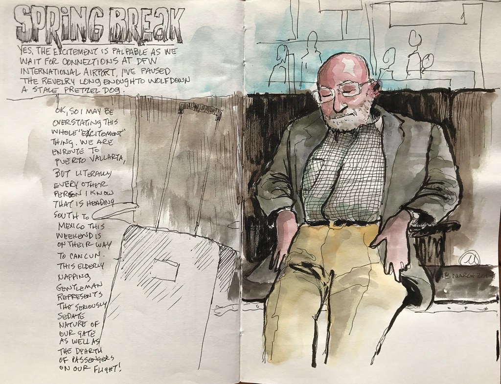
Nowhere was this more apparent than when we made connections in Dallas. My first sketch of the trip was a really quick one of an elderly gentleman napping as he waited for our flight to board. The surrounding seats were nearly empty, nor were there any loud, obnoxious college frat boys wearing those ridiculous beer hats you see on television. Although I brought along both my sketchbook and my watercolor sketch pamphlet, opportunity and convenience conspired to make the Canson sketchbook my favored choice on this trip. This meant most of my sketches were made with a pen or a brush pen: I used very little watercolor, and when I did it tended to be a bit cartoonish, as in the example above.

Travel tends to revolve around four things for us: The act of getting “there,” experiencing the cuisine of a place once you are “there,” exploring what is “there,” and interacting with the people who live “there.” We were to discover that the compound where we were staying made it incredibly difficult to leave. I can only presume the management wanted to keep all of their guests money and business in the markets and restaurants and activities they controlled. In frustration, our first meal was at a taco bar located in the glossy, high end Mercado at the center of this enormous property. In fact, the food was quite good but the experience was incredibly “Americanized.” Everyone spoke English, we were surrounded by Americans, and everything seemed to be set up to make Americans as comfortable as possible. We might as well have been in America, and we vowed to find our way off the beaten path and into town and thus, into Mexico proper. We needed to “be there.”

As I mentioned, our compound was enormous. One can easily walk for miles along the meandering paths that loop around the property, lakes, restaurants, golf course, and residence buildings. Each of these buildings had hundreds of rooms, each numbered individually. Just to provide some context, our room numbered in the 8,000 range. Our walk to the beach was a very pleasant mile or so, tracing those paths and skirting those buildings, mostly along verdant canals that in a truly Disney-esque fashion had been created to emulate the effect of authenticity. In fact, they were anything but and I refused to waste any of my time or paper on that subject matter.
We discovered that to get off the compound and into the “real world,” our mile long walk to the beach was followed by another couple of miles south, down the beach and through the pool and lobby of the final hotel of the property. (Typically, we wound up hiking over ten miles each day.) This was the one and only point of egress, and once on the street spilled out into the community. A short distance further found us at the Marina, with a small square and market, and several eateries. Along the street were vendors selling various foods from their cars or the back of pickups. Some authenticity had seeped into what we were soon to discover was a community created from whole cloth to cater to the tourist trade. The town of Nuevo Vallarta seems to exist solely for travelers who have more interest in sitting beside a pool than they do in the people and place in which they have situated themselves. I know it’s naive to say so, but it rather shocked me, this discovery.

One eatery alongside the marina combined a bit of traditional flavor with California-style fusion. The food was excellent and the people – as I found to be universally the case, regardless of where we found ourselves – were wonderful. I sketched out the scene in front of me, and as the place takes pride in “slow food,” there was ample time to not only block in the composition with pencil, but also to complete the inking and color on site as well.

One thing I’ve experienced is that when I sketch in public, people around me are curious to see what I’m working on. They’ll often surreptitiously find a reason to walk past me, to glance over my shoulder, and only very occasionally stop for a shy chat. Not so the Mexican people! No, in fact many times curiosity led to exclamations of “Excellent!” and an admiring conversation. I enjoy sharing what I’m working on with passersby, and had many opportunities to engage in warm meetings this past week.

Don’t take my comments above amiss. I enjoyed hanging out on the beach as much as anyone, and used my incredibly leisure time under the thatched umbrellas to develop “compound” gesture drawings with a Pentel Pocket Brushpen. Every now and then I’d add a splash of color, but make no mistake: these are graphic drawings, not paintings.
I refer to these as “compound” gesture sketches because none of them represent an actual moment in time, but rather are an amalgam of moments. I’ll sketch part or all of a passing person, and then complete that person or add another as someone else walks into my field of view. Most people are actually a collage of two or more subjects. Starting at an arbitrary point on the page, I’ll continue to work out to the edges from there, every now and again going back to the original starting point and working back out toward the edges of the page. This strategy helps to create visually leading lines and a point of emphasis…as a designer, it’s almost impossible for me to turn off the need to “design” each page.

The bright sunlight and strong contrasts between light and shadow leant themselves well as subject matter to the graphic qualities of the brush pen. Growing up, one of my favorite newspaper cartoonists was Milt Caniff (Steve Canyon, Terry and the Pirates). I enjoy a sort of camaraderie when these brush pen drawings take on some of the graphic qualities of those newspaper comics I admired so much.


Sometimes, my sketching tends to get a little too “precious” looking, as seemed to be happening in the drawing below. That takes place after I’ve had a lot of luck working really quickly and loosely, and my hand begins to tighten up. When I see this taking place, I change drawing tools on the next page of the sketchbook.

Such was the case here when I moved from the brush pen (above) to using mostly a fine line marker (below.)

This wall of skillets at Estudio Cafe intrigued me enough that I went back for breakfast. Sketching with an Omnicrom marker, I found my line loosening back up again as I munched down on another excellent repast and found myself entertaining yet another group of interested patrons and servers. This sketch benefitted from the addition of heavy black lines from my brush pen later on.

One afternoon sitting around one of the many pools, I found myself intrigued by the potential for exploring negative spaces using nearly solid blacks and whites. The combination of the two pens worked hand in glove to pull off a sketch that I like very much for the composition and depth. In some ways this one feels almost like cut paper.

One of the very few drawings I made in the watercolor pamphlet was this (sort of) continuous line sketch. Sitting on our balcony, I attempted to draw some of the surrounding buildings in our compound by keeping the pen in contact with the paper as much as possible. It’s really more of an exercise than anything else, but it’s fun and helps me to refocus on the important parts of a subject.

I haven’t decided if going back into the sketch with heavier lines and watercolor wash was a good idea or a mistake. Let’s just say that it is what it is.
Meanwhile, I was still feeling a need to get off of the compound entirely and into more authentic communities. It was time for me to “be there.”

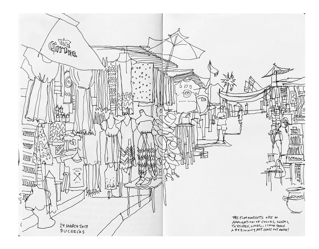
A taxi to Bucerías was just the ticket. I set myself the challenge to leave the lead holder behind and to work only with one of the pens directly. Of course, this meant that anything involving people automatically turned into a collage governed by luck and chance, but if I worked quickly enough I might pull it off.
And here’s where I got most excited: in the flea market.