Zigging when I’d planned to zag instead

14 May, 2024.
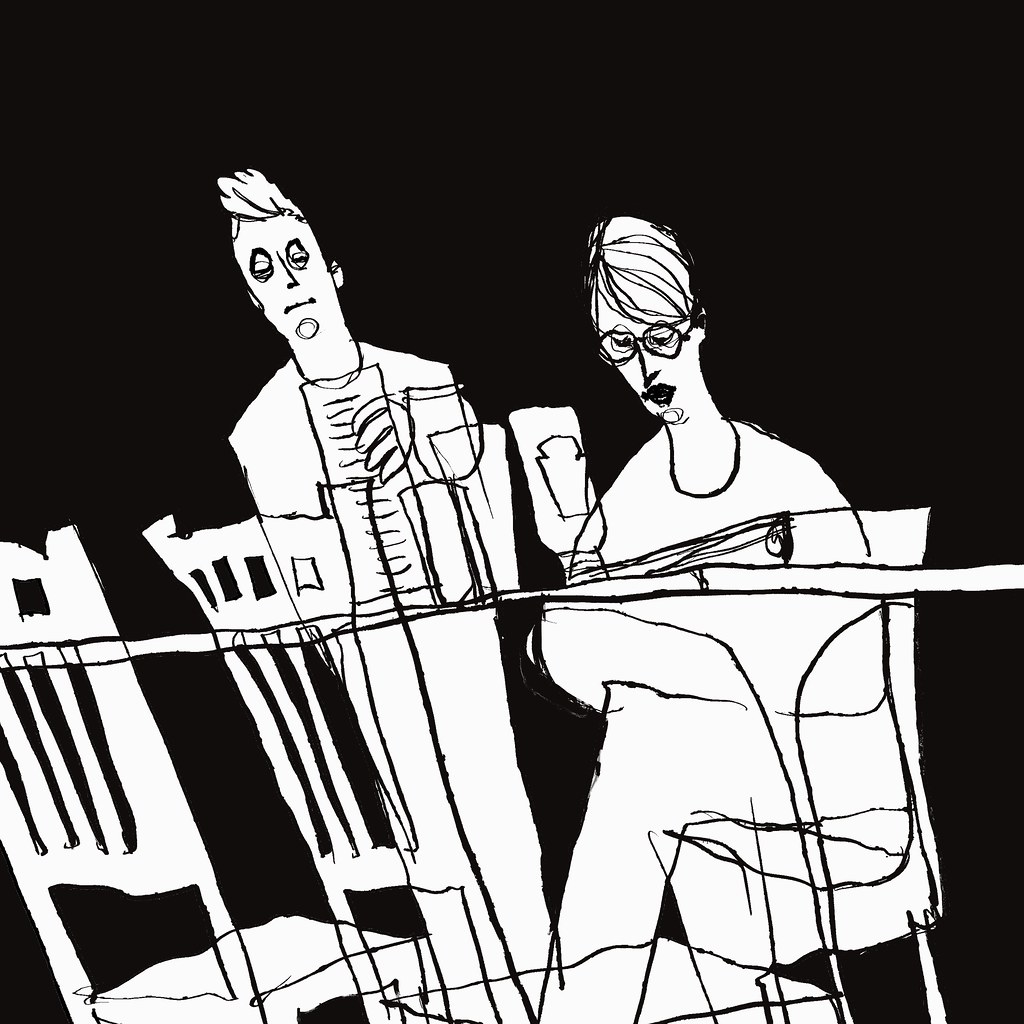
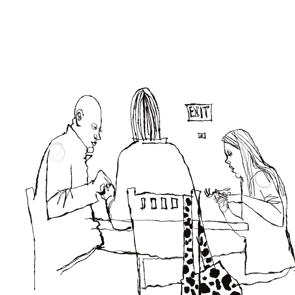
Sometimes – often, if I’m honest with myself – drawings don’t go the way I’d planned. Sketches can have a mind of their own, and they begin to “zig” when I’d planned on “zagging.” Case in point, the sketch above. I was intrigued by the body language I saw happening between the two people at a nearby table. He was speaking and she sat in absolutely rapt, almost worshipful attention. Her eyes were lit up, and it seemed to me she was absolutely mesmerized by him. And yet, the story my sketch seemed to want to tell was one of disconnect and boredom, almost as though she was not paying attention at all, perhaps bored at more of the same thing. It’s an interesting contrast, between the perceived story and the narrative I wound up actually telling.

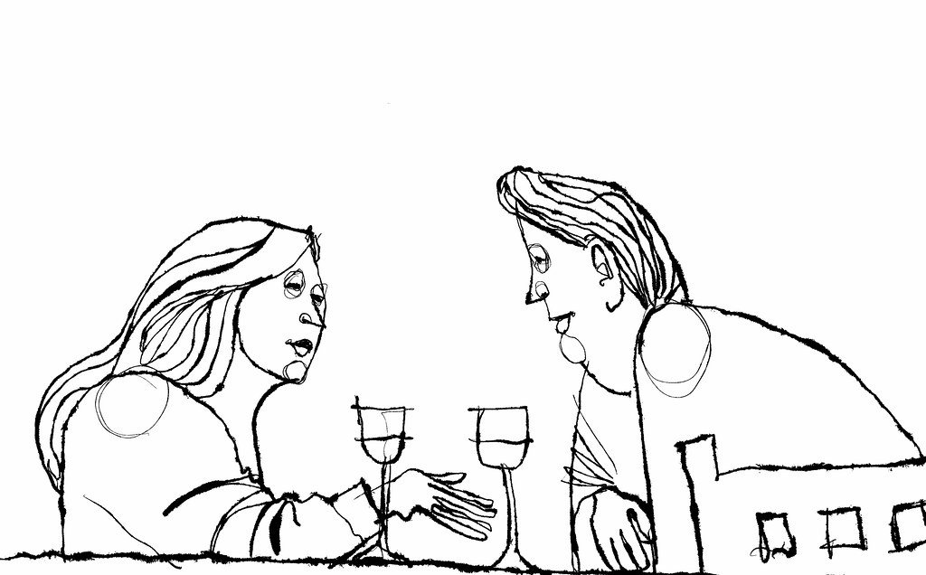
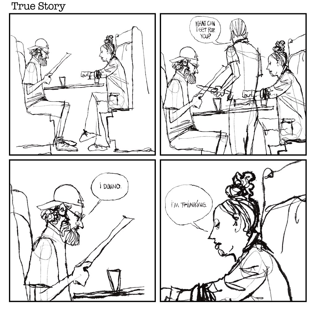
This next couple – same table as the other two, incidentally – wound up telling a similarly disinterested tale. He is focused entirely on his sandwich, consumed entirely by wrapping his lips around it, wrapped up entirely in what was clearly enjoyment. I saw her leaned back, resting one hand on a wine glass, and spinning a yarn. The expression I drew, instead, seemed to emphasize both a visible and a psychological gap between them.