Peaceful simplicity.

1 May, 2019.

I love to create sketches that are left with an “unfinished” – or at least half-finished – appearance. It amuses me to allow viewers an opportunity to complete the work in their minds. A gray background limited to black and white demands elements be simplified, distilled down to their core essence. This sort of sketching becomes a visual game of formal qualities, choreographing elements of line, space, shape, and value.

Hiking along a wooded path, the trees form patterns of linear verticality. It’s easy to picture this space, divided into shapes of black, gray, and white. In fact, the intellectual challenge of mentally assembling this visual puzzle is enjoyable. Choosing what to eliminate and what to keep in a sketch like this is an exercise in peaceful simplicity.

_______________
Bent nib fountain pen, Uni-Ball Vision pen, and white gouache in a gray Stillman and Birn sketchbook.

Oh, deer.

19 November, 2018. On a very chilly evening last week, I took a shortcut through the parking lot of a local lumberyard. Pedaling across the pavement, the first thing I noticed was a black 1962 or ’63 Impala illuminated under the tall light pole, the lid of the trunk partially raised.

It’s important to understand how truly enormous the storage space is in this vintage American automobile… it’s large enough that some of the tiny British and Italian sports cars I’ve owned over the years might come close to fitting inside. Certainly there would be ample room for my racing bike, and perhaps even several other bikes as well.

There was, in fact, ample room for the dead buck, which was the second thing I noticed. 

In Missouri, this is the time of year when one walks through forest and field wearing bright orange clothing. To do otherwise would be foolhardy. Outside of town, the world is populated with grizzled, gun toting individuals dressed in camouflage. Ducks, geese, deer, turkey, squirrel, quail, pheasant – and soon rabbits – are all in hiding from pickup trucks and John Deere hats… and apparently even vintage cars.

Sketching in Vermont

26 June, 2018. I’m home and relaxing in my comfortable leather arm chair. I’ve been absent from these pages for the past few weeks; June is my “travel” month. We’ve come to eschew laptops while we explore, which means no work, no writing – and no updates to this online sketching journal. But I’m back now, and it’s time to get caught up.

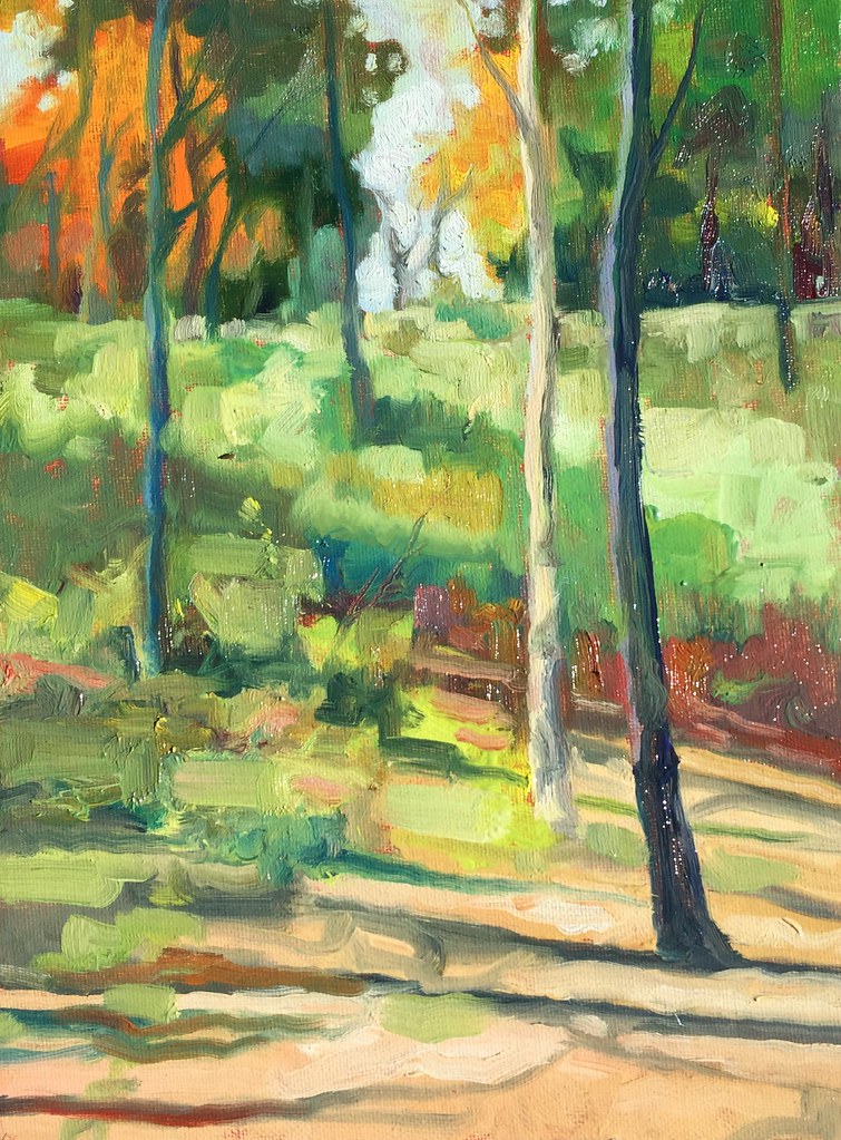
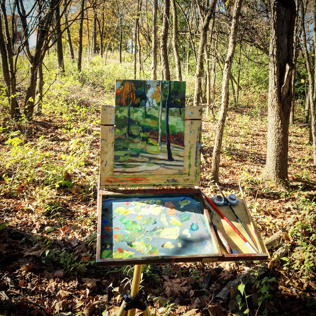
Over the next couple of days I’ll be posting sketches from Vermont, New Hampshire, Boston, and Martha’s Vineyard. The first leg of travel extended through large parts of Vermont and some of New Hampshire, where small towns are populated by colonial architecture before suddenly merging into dense wooded areas, rolling hills, and narrow, steep roads. I made the sketch, above, in a wire-bound Fabriano sketchbook. The thin pages take ink nicely but it took me several failed attempts to get used to the almost slick surface of the paper. Eventually, I got the hang of it but I prefer the slight “drag” my pen has on a paper with a little more tooth. The color, incidentally, was added on my iPhone using Adobe Draw. The jury is out for me on this approach – the process feel too sterile to me, even though the “product” looks interesting.

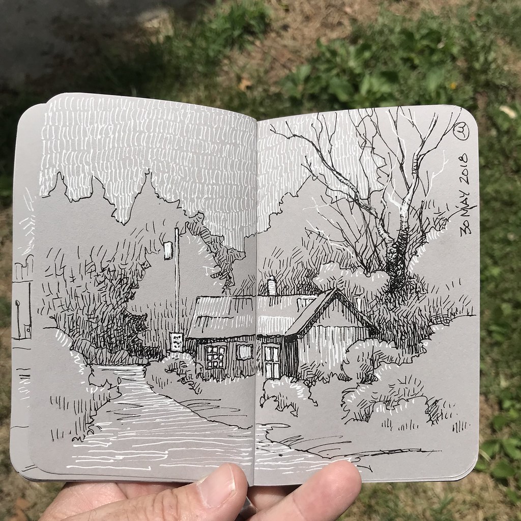
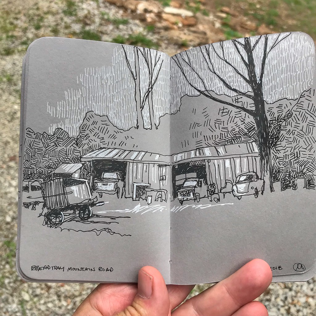
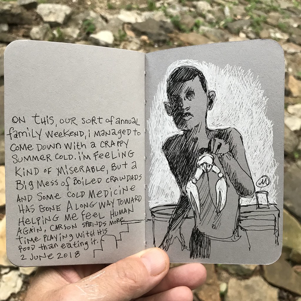
The small Stillman & Birn sketchbook I picked up before embarking is filled with a heavy, gray-toned paper. It’s worked nicely for making three-value drawings: black, white, middle gray.

And while it seemed at first that the limitations would result in a look that sort of resembles a block print, I’m discovering ways to loosen up a little. This is particularly important with the white gel pen, which demands a rather deliberate approach to the application of marks.

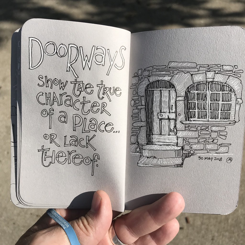
As usual, I found myself drawn to the architecture and the architectural detail. This little sketchbook provides a good structure for recording thoughts and sketches. The limited value range brings about a rather graphic look to the illustrations.

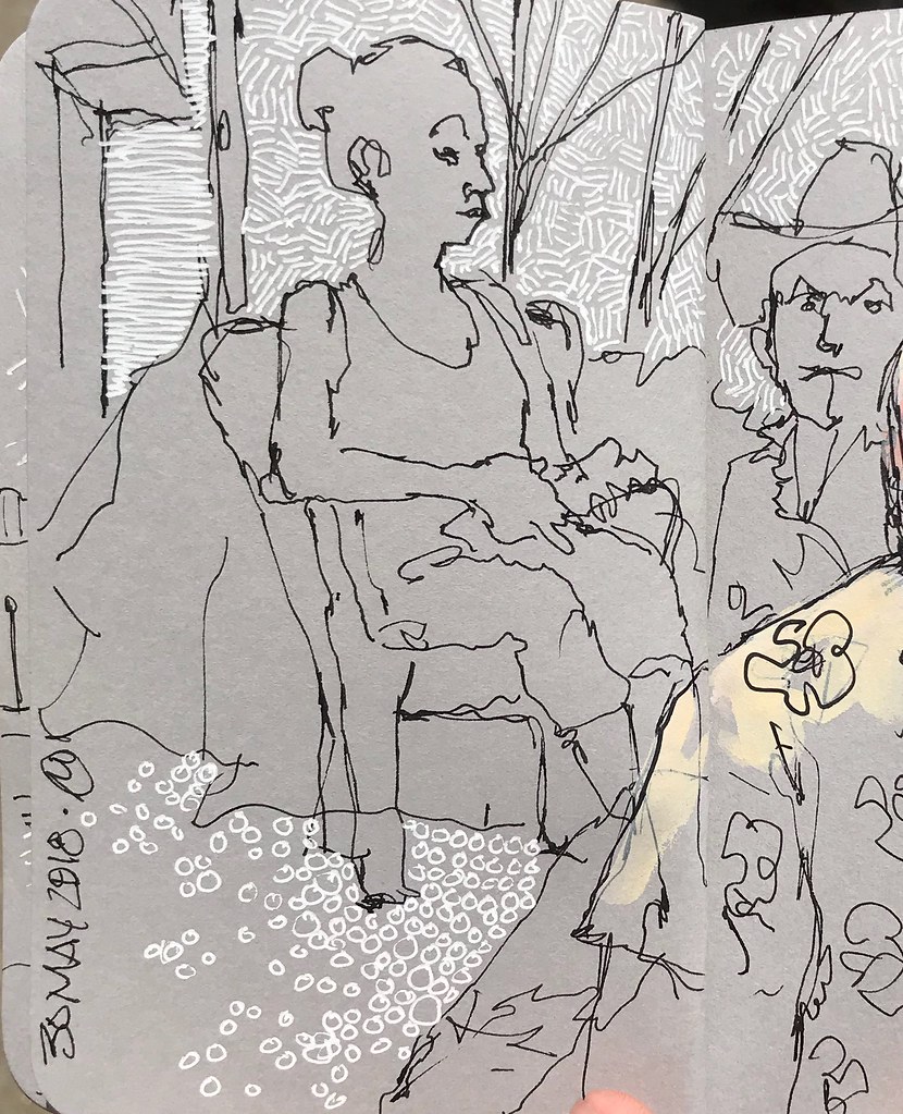
In the next post I’ll share sketches of people and the places in Vermont where they live.

Black and White, and Grey All Over.

4 June, 2018. Over the past couple of days I’ve carried around two pens – my trusty Uni-Ball Deluxe and a white gel pen – and this small, pocket-size Stillman and Birn sketchbook. As always, I’m interested in seeing just how far I can push my sketches while purposefully placing limitations on myself. In this case, the limitation is range of value: black, white, grey, and the implied value created by hatching.

It’s interesting to me how different textures can be achieved by varying the strokes, as well as changing the lines into shapes.

The format of this booklet is so damn small that it does force me to consider positive and negative relationships, as well as recognizing the limitations of drawing across gutters and within the margins.

I also have to stop myself from going to far, making too many marks. Limiting the mark-making and relying on contrasts is effective. As with my choice to draw and later add a spot color to sketches, there’s a mechanical appearance when working on the grey paper that I like.

Selectively choosing which elements get the addition of white allows me to be selective about which elements get emphasized. I think there are some real storytelling opportunities working with this illustration approach, but for now it’s just me fooling around.

Childlike Simplicity

5 July, 2016. The extended road trip is just about over for the summer. One more short visit to the Ozarks in a couple of weeks, and then I’ll be stationary for a while. Stationary – but definitely not idle: I’ve got a book project in the works, a return to academe, and an exhibition coming up in September. Selecting, printing, matting, framing…

Meanwhile, the journey has been a productive one and I’ve made a lot of sketches. Never nearly as many as I think I’ll make, of course. It’s always the case that I plan to draw more than I actually do. But I’ve got a lot of reference material and ideas for new work.

Traveling is fun and exhausting. I like seeing different people, and I really enjoy trying out new tastes while continuing to relish old favorites. Smith’s is an old favorite and we stop nearly every time we pass through that part of Missouri in which they’re located. Like all good country diners, they’ve got an amazing selection of made-on-site pies, their pork tenderloin is (literally) the best on the planet, and a Friday night visit means a short wait for fried catfish and sweet potato fries. We weren’t the only people biding our time either – fellow travelers and local folk alike are seated in this humble setting, knowing that a hot platter of catfish is only a few minutes away. Time enough to drink a little iced tea, make sure the bottle of hot sauce was adequately filled, and get in a quick sketch of one local patron.

The last few days of travel have been remarkably wet, so most of my sketches have been made from underneath a porch awning. I’ve worked small and simply, focusing on shapes more than detail, which allows me to consider compositional arrangement. I like this approach now and then to keep the work from getting too stiff or too precious. This is especially important right now because I’ve got two commission pieces that need to be executed this month for a regular patron.

The work illustrated on this blog will, as it tends to do every summer, evolve a little bit as I transition from the field and back indoors to the drawing table. Meanwhile, I’ll enjoy the childlike simplicity of this style of sketching. (Watercolor on Strathmore Aquarius II watercolor paper.)

Nature Sanctuary

8 November, 2015. I often find myself drawn to the paths of Martha Lafite Thompson Nature Sanctuary, a small, unassuming tract of hilly, wooded land on the outskirts of Liberty, Missouri. It’s nearby, and within five minutes I can be surrounded by trees and birdsong. Especially in the early morning and late afternoon, this is a wonderful location for painting and sketching: long shadows trace the contours and undulating surface of the hills that make up nearly the entirety of the property.

As I reconnect with oils, I find a common pursuit with that of my line work and watercolor: Keep things loose and free. Avoid the temptation to overwork; enjoy the flow of mark making, the pushing around of paint, the calligraphy of line – and accept the gifts of chance as they are presented. I want to see that lines are drawn, that mistakes are made, that the surface is painted; if the process gets too precious then it’s no longer even about the process, but about the end product…and that is anathema to the process.

I’m not interested in photographic – or even accurate – representations so much as I am reacting to the moment and place. I remember the first time this occurred to me. I was in college; there was a massive thunderstorm brewing and suddenly I was overwhelmed with the desire to be a part of it. For me, this meant rapidly assembling a painting kit and heading outside to capture the elemental fury that was about to take place. My roommate laughed nervously and told me I was nuts. I vividly recall the desire, as much as I do the frustration of not being able to capture even the simplest part of the storm. Thirty years later I understand that I was approaching things as if I was a camera, rather than as a painter. Faithful documentation – even had I the skills to do so back then (and I decidedly did not) – was missing the point. (Clay County, Missouri. Oil on tinted panel, 12 x 9 inches.)

Exploring a few new paths

5 April, 2015. I’ve spent a pleasant several hours exploring unfamiliar paths that dart in and out of the suburban core of the Northland in Kansas City. Last weekend I discovered this old house adjacent to one such trail, a structure quickly finding its way back to the elements! I intentionally traced my way back today so that I could do a little bike sketching here and in other spots before trekking off onto a few brand new paths. Who’d have thunk this sort of derelict house and woods would still exist amidst all the nearby new homes? (Lamy Safari medium nib in Canson sketchbook.)