Back to school

28 August, 2022.

I’ve been carrying around a small sketchbook in either a hip or shirt pocket for days now without making hardly a pencil line. We just wrapped up our first week of school, our first five days with students this year, and my focus has been on the introductory mark-making experiments I introduce to kids. Only a couple lessons in and it’s immediately clear that there are enthusiastic students in attendance who are engaging in the inventive line and fill challenges I employ to tease out skillsets. I may have more than a few visual “problem-solvers” this year. That said, at the moment I’ve not much time leftover for me or my own personal artistic interests. So the small sketchbook must suffice.

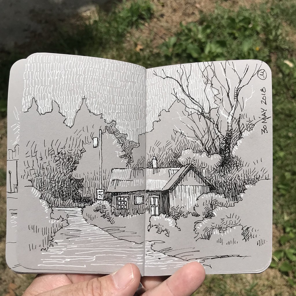
The drawings in these sketchbooks get blocked in very quickly. The page is only about three inches wide, so the sketches are necessarily little more than thumbnail studies in shape and value. I find making them very satisfying: a composition can be structured in a matter of minutes using a pencil. (It’s the ultimate in minimalistic sketching experiences.) All of the examples above were inspired by places I drive past and my return trip after a short visit to my home town.

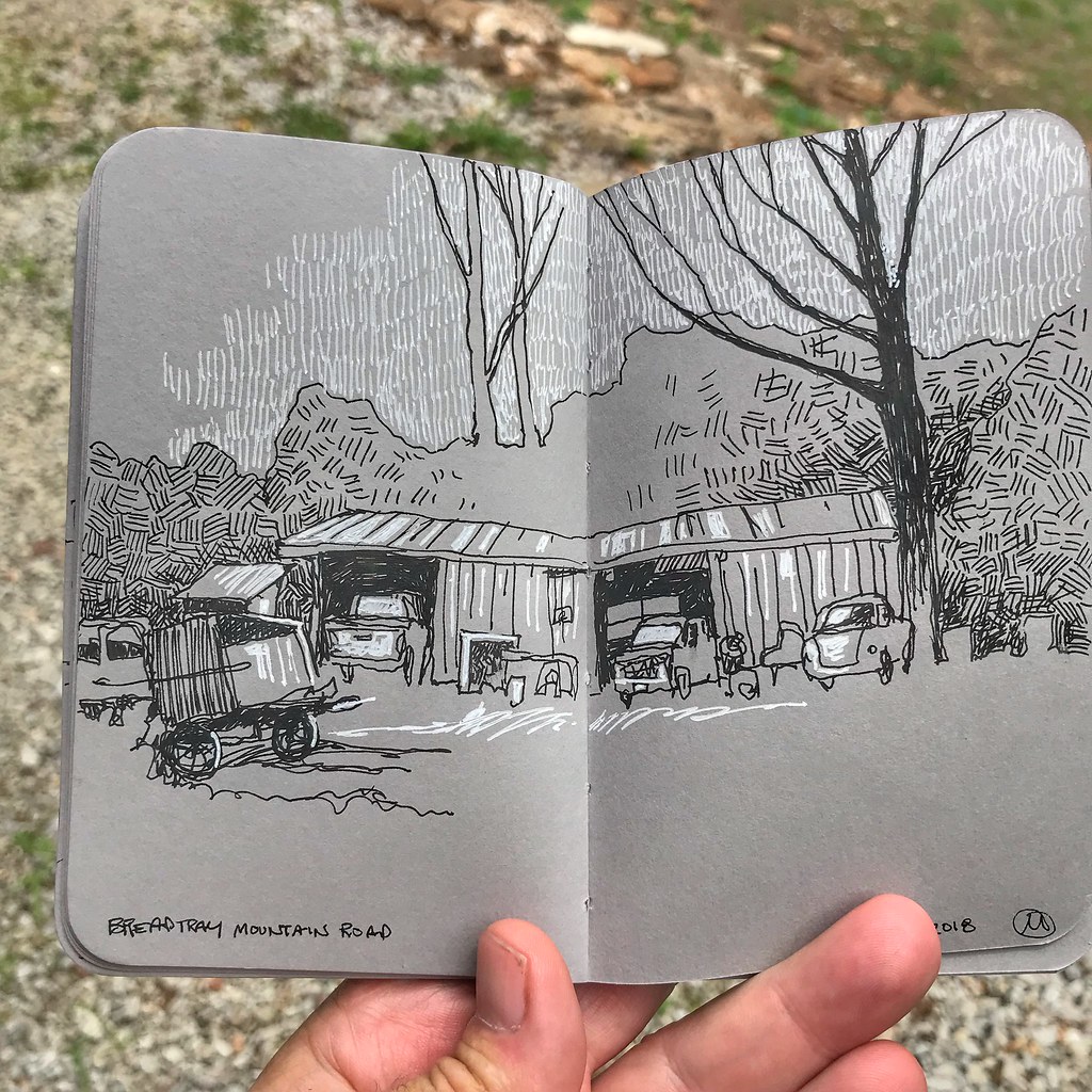
The abstract qualities of this barn materializing from behind a hill of grasses is so simple, but I find the shapes very pleasing. I should paint color studies of it this afternoon, I think. The angle of the roof, where it abuts sky is especially interesting to my eye, and it’s all offset by the tonality of shadow present in the foreground and sides of the structure, nearly silhouettes, in fact.

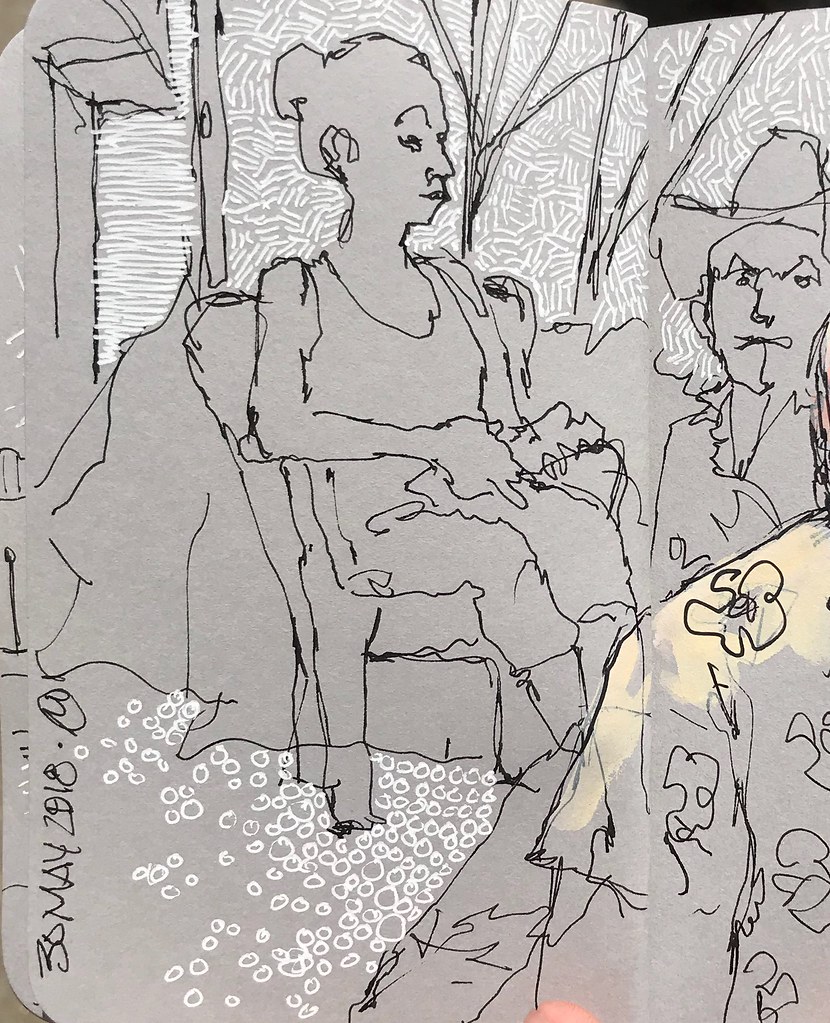
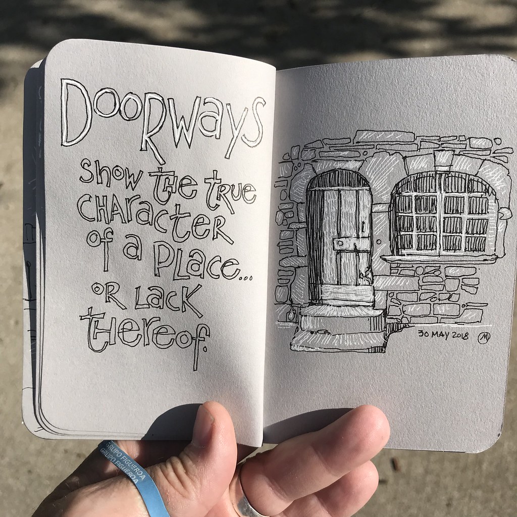
My subject matter triad has primarily evolved into: Places, people in places, and things that take people places. It’s been an organic evolution, much less purposeful or planned than the early years when I felt a desperate need to develop a “style,” a look by which I might be recognized. These things enter my sketchbook relatively unbidden; they interest me and so I draw them. Sketchbooks have liberated me from a need to generate more “important” wall sized artworks. Sketchbooks are mine alone to share as I see fit.

Each time I sketch an old car or truck I think that my interest has finally run its course, that I’ll have drawn my last interesting old vehicle. But then I’ll encounter another, as I did this really vintage auto, and soon enough scribbled marks are being made.

Another sketcher has tentatively identified it as a 1919 model of a Ford. The carriage style cockpit is intriguing, with curves that are nearly Victorian in nature. It’s almost like period furnishings, don’t you think?

I’ve also been pining for an old pickup truck. Nothing exotic, you understand, just an old beater that would be useful for transporting my bikes or conveying art stuff from one school to another. Art teachers are natural hoarders, and part of my life seems to be facilitating that aspect of our collective personalities! Be that as it may, every time I encounter an old truck my interest is piqued. Sometimes I even wind up drawing them.

A lot of roads and paths seem to wind up in my sketches. I think it’s partly due to the naturally graphic quality, and I like the way those elements can be used to literally lead the eye in and around and through a drawing. But formalistic qualities aside, there’s also a narrative thing happening with a road: Where does it come from? Where does it go? Like a story, there’s a beginning, a middle, and an end.

Adding a bit of color.

5 March, 2020.

Sitting at my drawing table, I added a bit of color the other night to my warm up sketch for #oneweek100people2020. I dug out my Caran d’Ache Neocolor II pastels. I’ve largely overlooked these very useful paints for the past few months, and that’s entirely on me.

These water-soluble crayons are a bit like oil pastels that literally melt with a brush and water, and make wonderful washes. Although I’ve had to experiment with different papers before finding surfaces I like, the crappy soft and toothy index paper I found in our District print shop worked well.

I don’t find these crayons especially useful for urban sketching. A box of them is not nearly as compact and transportable as a small paint kit or a pocketed pen. But they are great for adding touches of fresh looking color, and I like having the option of leaving some drawn marks in addition to the watery washes of color.

_______________

A Casino

18 January, 2020.

Casinos are weird places. There are, of course, the floors of gambling, lights flashing and a constant, unending cacophony of bells bellowing forth from row upon row of slot machines. Those machines themselves, do one thing – gobble down one’s money – but are decorated in a wide array of colors and graphics and themes. Beyond the domain of the gamblers are halls of eateries, theaters, day care centers, park benches, and a strange environmental sense of not being entirely indoors, yet not being outdoors either. In fact, there’s little evidence of day or night – an effect, I suspect, that is intentional design.

_______________
Sketched with a Uni-Ball Vision pen, then scanned in and shading added in Procreate 5 with an Apple Pencil.

Galveston people.

29 March, 2019. Gumbo for dinner! I understood that Little Daddy’s Gumbo Bar made great stuff, and wasn’t disappointed. The roux was chocolate in color – way beyond “peanut butter” roux. The aromatic and richly colored concoction was hypnotic in a way: what would be revealed under the inky pool? Well, chunks of chicken and andouille sausage, of course, along with okra. But no corn bread side, sadly. Sigh.

Our server was hip and cool and patient and just a little bit wacky. And everyone at the counter was called “babe.” I felt right at home.

The “Pleasure Pier” – what, I wondered, could this place be with a name like that? Having passed dozens of adult stores along the Interstate on the long drive south, it occurred to me that there would be a red light at the entrance. Happily, it turned out to be an amusement park.

Closer to my hotel, people staked out a warm spot on the beach, sheltering from the wind in huddled groups.

________________
Uni-ball Vision pen and watercolor wash in Stillman and Birn sketchbook.

Thumbnails are important.

2 August, 2018. I’m in charge of this month’s Urban Sketchers demo tomorrow night. A lot of sketchers seem to be curious about the attention I’ve been giving to gouache on gray-toned paper, so that’s going to be my focus. But it occurs to me that the technique is really only a delivery vehicle; unless the drawing or painting has been designed to create visual interest the technique really doesn’t matter much. With that in mind I decided to outline some of the steps I occasionally take when I plan a “people” sketch.

The first thing to understand is that people move. They are there and then gone. So it’s important to capture the gesture as quickly as you can (see above) if you want your figures to be believable. Focus on the most basic key lines. I seldom spend more than ten seconds doing so. (Think about it: In ten seconds, your subject is gonna be a hundred yards away, so you have to work quickly.)

Once you’ve got a gesture that you like, and a location that tells a story, take a piece of scrap paper (or better yet, tracing paper!) and place it over the gesture. Use the gesture as a guide for planning the form and how the clothing drapes. 

It’s ok to think about some general detail, but don’t focus on eyelashes or nostrils at this stage!

Figures move, but your “stage” does not. You can take more time to make as many thumbnails of the “space” as you like to ensure that the figure is placed in the most interesting position. Look for details that imply depth and scale now.

Design is important. It’s what makes a visual story interesting. Think about design as you redraw the sketch, dividing the composition into thirds. (Asymmetry is always more interesting than symmetry.) Experiment with eliminating detail, and with the figure ground relationship by massing values. Now, you’re ready to make a drawing.

This is the handout I plan to have on hand for tomorrow night’s demonstration. I’m hoping it will provide a little context before just diving into the technique. Feel free to download the image.

Black and White, and Grey All Over.

4 June, 2018. Over the past couple of days I’ve carried around two pens – my trusty Uni-Ball Deluxe and a white gel pen – and this small, pocket-size Stillman and Birn sketchbook. As always, I’m interested in seeing just how far I can push my sketches while purposefully placing limitations on myself. In this case, the limitation is range of value: black, white, grey, and the implied value created by hatching.

It’s interesting to me how different textures can be achieved by varying the strokes, as well as changing the lines into shapes.

The format of this booklet is so damn small that it does force me to consider positive and negative relationships, as well as recognizing the limitations of drawing across gutters and within the margins.

I also have to stop myself from going to far, making too many marks. Limiting the mark-making and relying on contrasts is effective. As with my choice to draw and later add a spot color to sketches, there’s a mechanical appearance when working on the grey paper that I like.

Selectively choosing which elements get the addition of white allows me to be selective about which elements get emphasized. I think there are some real storytelling opportunities working with this illustration approach, but for now it’s just me fooling around.

One Week, 100 People, 2018


10 March, 2018. #oneweek100people2018 – that’s the hashtag for this past week, the one that signifies participation in what has come to be an annual sketchers challenge: Draw one hundred people over a five day stretch. Google the phrase “one week 100 people” and you’ll see it popping up on artists’ and sketchers’ blogs right and left.

My first sketches were a sort of montage of drawings made over a day or two on a section of watercolor paper that measures about 5.5 inches tall and 28 inches wide. As I’ve noted before, my favorite watercolor paper for urban and travel sketching is the lightweight Strathmore Aquarius II sheet. Cut into four equal segments 28 inches in length and then folded into an accordion-style pamphlet, it’s easy to carry and easy to sketch on just about anywhere, standing or sitting.

I prepped the sheet by lettering it ahead of time, followed by adding sketches of people I observed one and two at a time. The process was pretty organic, which is not unusual for the way I approach most of my sketching.

Taking me up to 99 people, my Art I class served as captive models: I sketched them while they painted and finished up adding their assignments to a digital portfolio they owed me. I stopped at 99 on purpose, in hopes that number 100 would be something special.

As I did with all one hundred and one in this series, I drew with a Uni-Ball Deluxe. I playfully splashed washes of color onto the panoramic sheet with which I began my week, but this second drawing was made on brown Canson paper. I debated adding gouache but decided instead to use hatched lines from a white gel pen to define the negative spaces and clarify the figure/ground relationship a little better.

Number 100 and 101 didn’t turn out to be a spectacular or dramatic drawing. It happened, appropriately enough, in a rather spontaneous fashion: On the last day of the challenge I found myself eating lunch at a Chinese buffet. The place is popular with a blue collar crowd and I enjoy being shoulder to shoulder with people from all walks of life, chattering away in a diversity of languages. I think of it as a sort of miniature “everyman’s” United Nations.

The play of figure/ground relationships are borne out through the contrast of black and white. It’s a favorite graphic ploy of mine and I like the way this visual strategy allows me to keep a composition interesting without the need to add unnecessary detail.

Touch of Color

4 March, 2018. It’s “double post Sunday!” Because I’ve two different things to share today, I’m splitting my journal entries into separate posts.

Earlier this week I sketched in a local pub while sipping a Rylie Porter and enjoying plate of their Cajun Shrimp Special. I’d already forgotten that Monday is the start of One Week/One Hundred People, an annual sketching event I really look forward to, so I didn’t realize my sketch was sort of a warm up for the coming days. I was just scribbling with a pen.

I enjoyed creating a sense of depth with the overlap of figures observed in the pub but felt it needed a little more punch. A couple of days later I tossed a sloppy wash of Opera Pink and some violet over the faces, with no thought about detail at all. I simply wanted to engage in a little “push/pull” with the cool vs. warm hues.

A touch of color was all that was needed to make me happy.

Travel Sketching

22 July, 2017. Sketching while traveling is a unique experience in some ways. For one thing, one is encouraged to observe the world as though one has never seen it before because in all likelihood this may be the first time to encounter a place, people, custom, or event. I feel a degree of freedom to simply scribble notions of these encounters in the form of sketches which, often enough, tend to fluctuate between medium. Do I have time to sit and observe? Am I feeling rushed? Or wanting to move along soon to eat? Is the opportunity fleeting? Events of the moment predicate the tool I use to sketch.

Watercolors are like a puzzle. For me, they are spontaneous and less about planning than one might imagine. Instead, they are more likely to be an exercise in figuring out what to place where, and how much detail to labor over or ignore. I place a colored shape and then look at the page to figure out where to work next, repeating this approach over and over again, moving from left to right, top to bottom. It could hardly be described as a science because I work mostly from my gut. I do consider contrasts of cool to warm colors, as well as contrasts of value, but the approach is definitely a different mindset than when I use pens to sketch with.


Working on the thin, cheap paper of a sketchbook with watercolor can be challenging. You have to not work the paper too much or risk rubbing clear through the sheet! A light and restrained touch is better than overworking, and results in nice blooms of color that I especially appreciate seeing appear. During my recent travel to the islands of Hawaii, I found myself using this approach to capture scenes that were, for the most part, without motion or movement.


Pens are also a tool of spontaneity for me, but much more visceral than painting. Even when I add watercolor after the fact, the line tends to be the most important, most informing aspect of the drawing. Sometimes precious, but more often than not nearly schematic, my lines are the truest extension of my hand and the most comfortable means of expressing a visual that I know.

Pens work better for me to capture the gestures or caricatures of people doing whatever it is they are doing. I like incorporating “field notes” into my sketches as a reminder of the experience.


Pencils are the most basic of drawing instruments and the thing nearly every one of us learned before any other tool or drawing instrument. Although my curriculum determines that I teach the broad range of dynamic value one can generate with a pencil, my own pencil sketches tend to be quite loose and expressive. I have to make conscious decisions to do things a certain way so that if I wind up adding color later the sketch isn’t constrained too much by one media or the other. I don’t want the drawing to dictate the entirety of the painting.

Sidewalk Sketching in Milwaukee

28 June, 2017. I was in Milwaukee all of last week, in a professional development workshop at the Milwaukee Institute of Art and Design (MIAD.) The workshop itself was well worth the long drive and I wound up really enjoying my stay in Milwaukee’s historic Third Ward. The opportunities for street sketching were literally everywhere – all I had to do was plunk myself down at a sidewalk café, order a glass of wine or beer, and then use my pen to observe life in progress, all around me.

I gravitate toward moments of thoughtfulness sometimes, and the gentleman at the top of this article caught my attention for that very reason. He seemed to me to be one of the world’s great listeners, focused entirely upon what his unpictured companion was saying.

Some people out on the street – passers by, that is – seem to avoid eye contact at all costs, while others flash you a quick smile. It’s just a quirky little facet of human nature that I’ve noticed. I would swear that I passed this same woman at least three times during the six days I was there, and each time she maintained a steadfast and unwavering gaze directly in front of her.

I chuckled to myself as I watched this young woman, clearly bored with the table conversation of the larger group around her, surreptitiously check and recheck her cell phone for something more interesting. Eventually she seemed to begin to read something lengthy – a book, I’m hoping!

Each morning around 5.30 I’d jump on my bike and ride the path that runs alongside the lake. It meanders through neighborhoods and parks and abuts various buildings. A few miles into my ride, I would pass the Northpoint, a burger and shake joint that looks like it’s been established at the current lakeshore location for a long time. One morning, well before the place was set to open, I noticed a large Yoga group using the site to exercise.

The lakeside path is quite wonderful and caters to a variety of early morning joggers, walkers, and cyclists. Some are commuting to work, others are getting in their exercise or morning constitutional. Many, like me, are simply enjoying the exhilaration of being outdoors for a grand morning.

The majority of my sketches were made after the workshop concluded each day. Around five, the streets would become active and sidewalk tables would begin to fill. Quick sketches of people were easy and models were ready to hand and in abundance.

I was impressed by the number of cyclists in evidence in my neighborhood. Riders were everywhere, bells were in use, and everyone was polite about the roads, sidewalks, and paths. It all seemed to fit together quite naturally.

(Everything was drawn with a Uni-Ball Micro Deluxe pen in a Canson 180 sketchbook. I don’t think I used a pencil to rough in anything all week long, and I’m overall pretty happy to have kept the observational drawings light and moderately fresh, without overworking things to death.)