(Number two in a series of ten ideas I have about sketching.)
12 August, 2018. One of the more difficult concepts to teach young art students is the idea of emphasis. Novices sometimes have blinders on when they start to draw, and this tends to emerge on paper in one of two ways. Some find themselves focusing only on the object of their attention, to the exclusion of all else. They find themselves with an object plopped in the middle of the paper with no context to place, time, or relationship to the world. A billion or two very unsatisfying sketchbook pages look exactly like this.
Others go in the opposite direction, drawing everything in their line of sight, and even some things that aren’t. I know a few artists who pull this off very well, but it’s important to note that what they are interested in sharing is the overall texture of a place or thing: all of that incredible detail is the subject. For the rest of us, too much stuff is visually overwhelming.
What I ask myself to consider as I sketch is pretty simple: Why am I drawing this thing or place? What exactly caught my attention in the first place? An object? A building? A person? When I can answer that question I know where to focus my attention, and thus my drawing. I draw that. Everything else in the sketch that contributes to the story is important. Anything that does not is a distraction from the story and from the focal point.
So I don’t feel obligated to include tons of detail in those areas that are a distraction. Maybe they don’t even need to be drawn at all, or perhaps they need to be simplified into basic shapes or values.
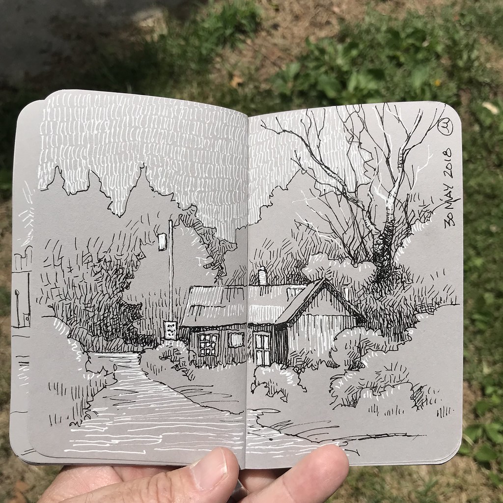
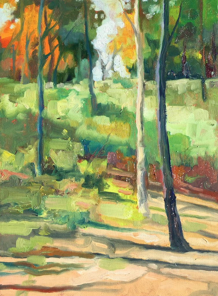
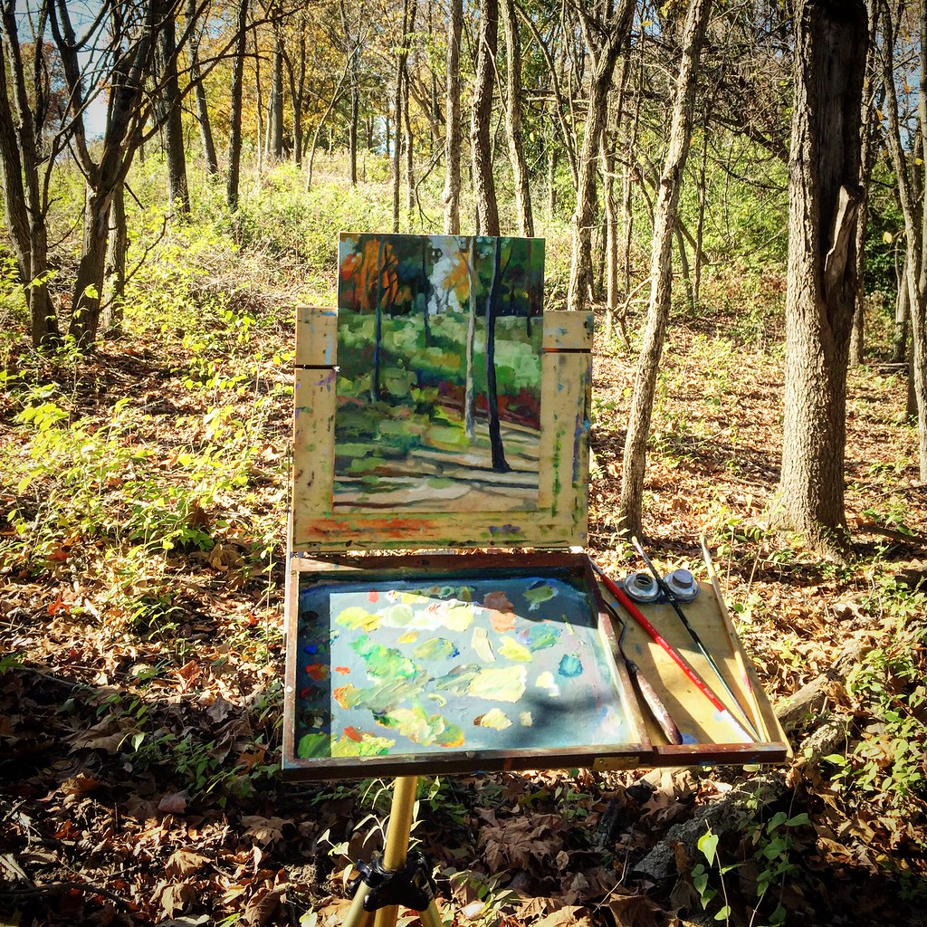
In the sketch above, made at yesterday’s plein air event, Paint the Forest, I was interested in the way that light played across the ground, tracing the topography of Line Creek Trail. Patches of light struck some of the other plein air artists ahead of me. And the receding perspective of the path itself helped to create leading lines, emphasizing these interesting areas.
All around was a cacophony of tree limbs and branches and foliage and trunks and all sorts of stuff. But none of it mattered, visually, because to focus on them would have meant taking away from those areas that interested me most. So all of that stuff got simplified into three elements:
- simplified verticals and horizontals
- simplified solids (or quasi-solids)
- simplified lights and darks
The path and the people are also simplifications, but they contrast from the surrounding spaces, crossing over or separating from them, contrasting by breaking from the patterns of striating light and shadow. Those surrounding spaces have just enough visual information to communicate a sense of place and, perhaps, a bit of theatricality. But because they are intentionally abstracted into directional shapes and patterns, they aid the viewer by moving the eye into and through the drawing.
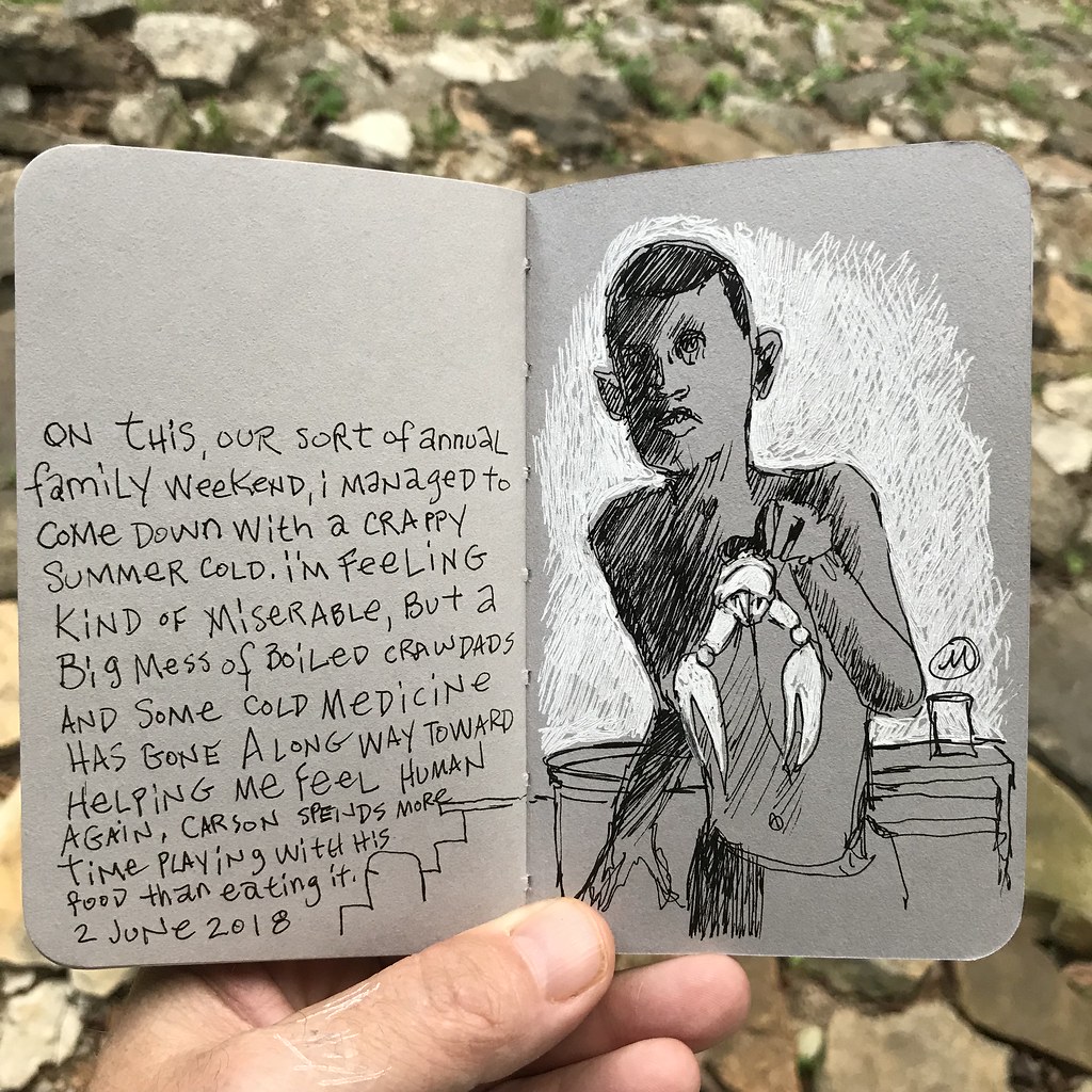
5.5 x 8.5 inches, using a fude tip fountain pen and Uni-Ball Signo white gel pen on Stillman and Birn gray Nova Series paper.