I’ve been teaching an adult beginning watercolor class on Thursday evenings for the past couple weeks. Much like my “day” students, watercolor is introduced in the first lesson by playing around, making marks, and experimenting. In the second lesson workshop participants followed along to create a landscape painting. Their progress was especially satisfying for the first time having used this medium, so in lesson three we’re going to give the old still life approach a whirl. I don’t want to overwhelm, so the composition will be simple. But I’ll throw in a few techniques along the way with a little wet-in-wet, blooms, and whatever else occurs to me at the time.
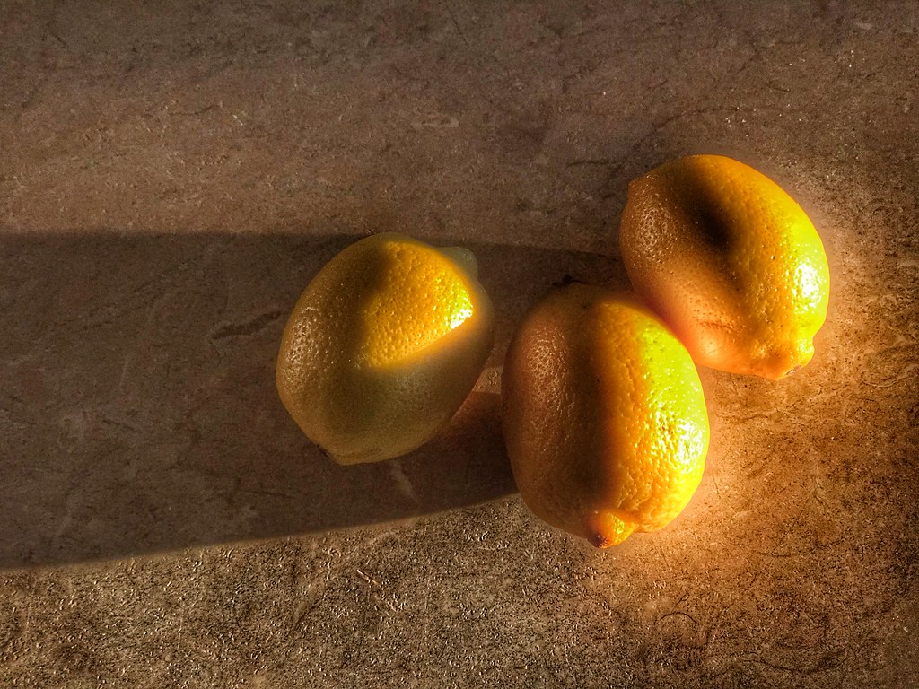
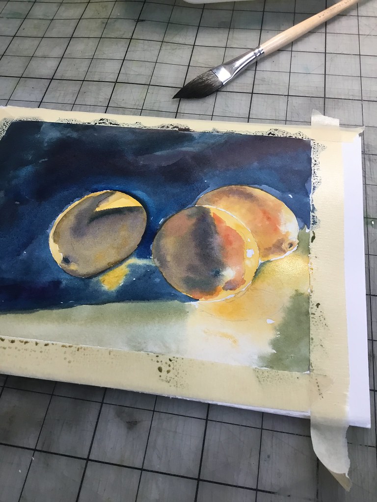
25 February, 2019. Sunday mornings are almost always magical. I get up early, as I do on most days. But there’s never much on my “to do” list, nor is there any real rush to get anywhere as there tends to be on work days. On sunny days, the light comes through the eastern facing windows of my kitchen, low and soft. No matter what is on the counter top, the long shadows and diffused, glowing light turns the viewing of those things into an aesthetic experience. This morning “those things” were lemons – but it could have just as easily been salt and pepper shakers, yesterday’s mail, or last night’s empty bottle of Bordeaux.
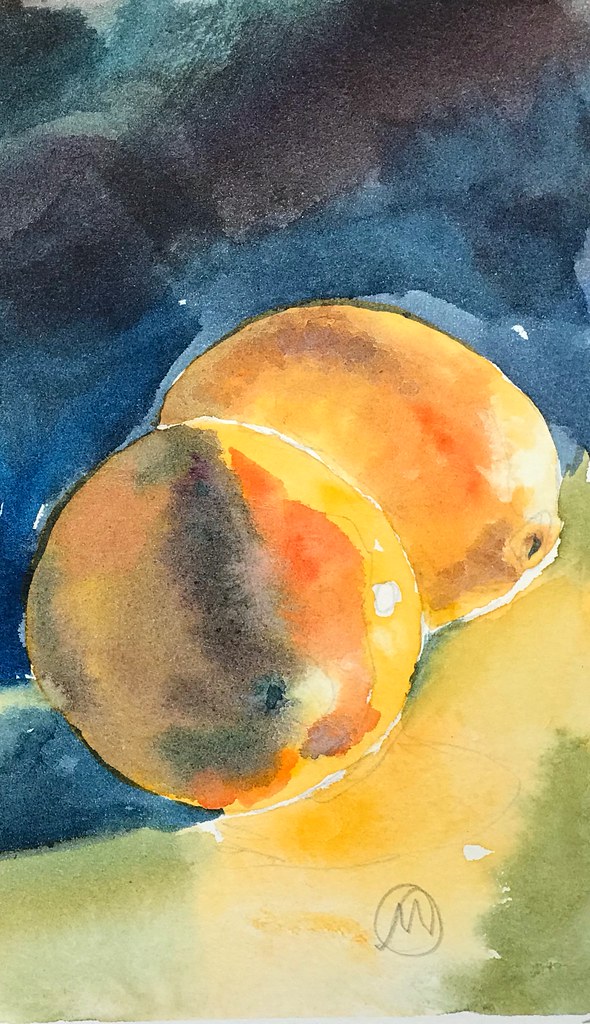
__________________ Watercolor on Strathmore Aquarius II paper
These lemons were on my kitchen counter early this morning. I love the way the light struck them, and the long, cast shadows that drifted across the surface. The reflections of color on the counter top is also something that I enjoyed seeing.
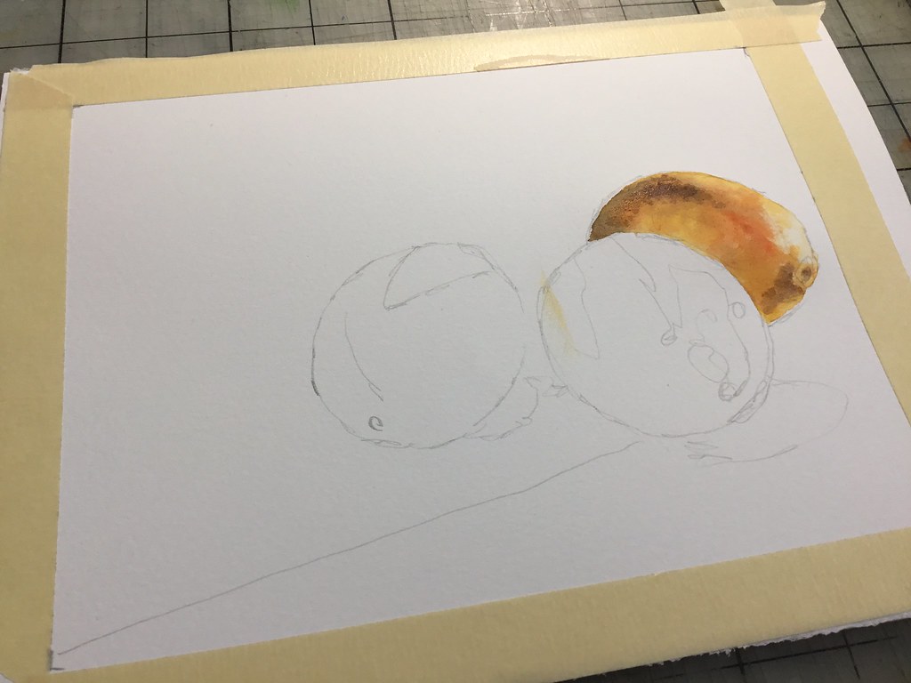
I have tried to begin with highly detailed pencil sketches, only to discover that is simply too much information. If I’m painting, I have greater success beginning with as few light lines as possible to work out the composition and relative scale of things. From there, I’ll let the process kind of determine what happens. (If I’m working with pens, I’ll usually forgo any pencil lines at all and just begin drawing.)
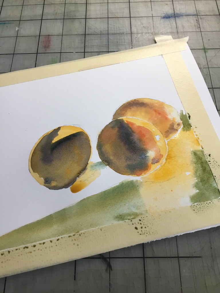
Once upon a time I would laboriously dry brush my work. No longer! I’m more comfortable letting the water and pigment kind of “dance” around the page. It either works or it doesn’t.
Value contrast is what brings things to life in a watercolor painting. I feel particularly aware of those contrasts, as well as what is taking place in the contrast between positive and negative shapes. Although I originally thought the asymmetrical composition worked with the three lemons, I realized that the energy was on the right hand side of the sheet. I eventually ignored the third lemon and the left side of the composition, opting to crop the image to focus on the reflective glow rather than the depth of background.