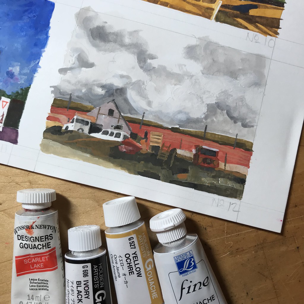
24 April, 2018. A couple days ago I mentioned that I planned to try out the Zorn Palette on a couple of these 4 x 3 inch gouache studies I’ve been plowing through for the 100 day creativity challenge. As of this writing, I’ve made a couple of attempts, the first of which is illustrated above.
The Zorn Palette is a limited paint group: Ivory Black, Yellow Ochre, a mixing white, and Cadmium Red Medium. Well, just like when I cook it took me all of about two minutes before I changed the recipe. Instead of Cad Red (which I don’t happen to own a tube of in gouache), Scarlet Lake was substituted. It makes a difference when mixing with blue hues, but as you may notice there’s no blue in this color grouping. Ivory Black has cool characteristics and substitutes in a very restrained, but harmonious, way for the blue corner of the color triad. Mixed with Yellow Ochre, some nice greenish toned mixes are possible.
I like limited palettes and have experimented extensively with various versions of the triad. In watercolor, my kit usually has a cool and a warm blue, red, and yellow, with a green for mixing earth tones. Many of my friends have commented on how few colors I carry – so imagine a kit of only four opaque paints! I confess that it felt very discomforting trying to rethink the color organization of what I was observing, and translating those into the limited color range of the Zorn Palette.
But stepping back, allowing a little time to pass and a little distance from the painted image… I rather like the subtle color range.

I love the gouache very much and I have a palette of only white, yellow cadmium and lemon yellow, vermilion red, carmine, ultramarine blue and sepia brown. I use gouache LINEL, are the best of Lefranc et Bourgeois. I can buy only in France, I live near the French border, I don’t know is possible in USA. Are really super
I have not used that brand of gouache. Is it one of the honey-based formulas by any chance?
are wonderful gouache, the top of Lefranc et Bourgeois. Here in Italy I cannot buy, I can in French, are really super: http://www.lefrancbourgeois.com/produit/gouache-linel/
I checked with two of my suppliers and both of them can get that brand for me in the United States.
you will see that you will like it very much, velvet texture and exceptional pigment. Even if you let the color dry on the palette, you can wet it and use it again. Bye! here the night is coming…
Thank you for the Referral. I will try this brand out sometime soon.
Hi, I found your blog through Doodlewash and very glad I did! I love your emphasis on keeping things simple, in the design of your sketch and materials. What limited palette would you recommend for watercolors and gouache? How to begin learning about designing a page? Thanks!
Hi Cathy! Well, first off there’s a caveat: recommendations for a list of colors is a little like recommending the most comfortable pair of pants. My taste and yours and that of the person standing next to us may vary widely.
The characteristics of gouache and watercolor are different enough that I’m still experimenting with finding a color grouping that works well for me. By contrast, I’m pretty pleased with a couple of color triads I use for watercolors. I wrote about one such configuration back in 2014: https://justsketches.wordpress.com/2015/01/01/limited-palette/
However, you can see my current palettes right here: https://c1.staticflickr.com/1/802/40061428535_3b6613ffe3_b.jpg I will never carry ALL of those colors at once though… normally I will limit myself to a cool and warm red, cool and warm blue, cool and warm yellow – plus a green. What’s that look like in practice? A transparent watercolor kit might look something like this: Nickel Titanate Yellow and Yellow Ochre; Ultramarine Blue and Cobalt Turquoise; Cadmium Red Light and Quinacridone Rose; Perylene Green (my absolute favorite, by the way, for neutralizing local color.)
Colors vary by manufacturer, so I’ve indicated which colors are made by whom in the link to my chart above. I’ve reached this combination of hues through a lot of experimentation: what mixes well together, what blends, which combinations neutralize, etc. I never use black in watercolor so it’s vital that I can mix colors to get a dense tone – not all kits can accomplish that.
Designing a page is a much bigger question. I certainly have opinions on strategies – in fact, they’re an important section of a book project I’m currently organizing. But to keep it simple, I first determine the viewer’s position relative to the horizon line. Based on that, I look for the most interesting silhouettes (think: outlines of the major shapes, which really means to think of your subject matter as an abstract painting first, a representational painting second). Then I will nearly always consider a visual triad: What are the three major areas of a painting? Can they be placed within a motif to create a triangle?
Thank you very much! Great analogy about the pants, I can certainly relate! The design idea is great, it’s nice to have a jumping off point to creating a page. I signed up on Instagram and look forward to hearing about your book!