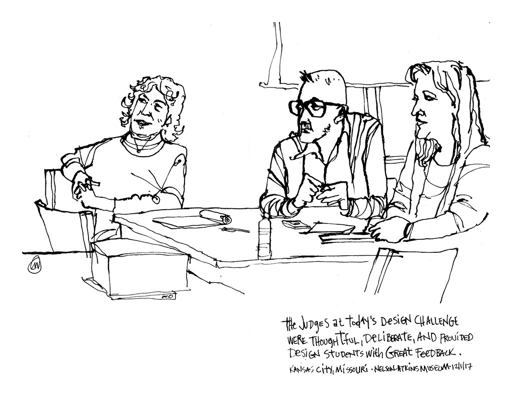
1 December, 2017. Sometimes teaching art is a busy, move-around-the-room-and-get-pulled-in-eighteen-directions-at-once, constantly in motion thing. And sometimes it’s a sit back and watch, try not to hover too much affair like it was Friday. My Design Team is comprised of four high school kids who were competing with kids from other schools at the Nelson-Atkins Museum of Art in the culminating activities of a Design Challenge. A Design Challenge is an interesting competition that blends the art of the design world with timed, creative problem solving of a real world design assignment. Students often have only a few hours to analyze a design problem, ideate, prototype – and then be judged. My role was to encourage and cheer on the process of ideation, but to keep my fingers out of the pie. The design problem had to be entirely owned by the kids. Rather than immersing myself in ennui I used my pen and sketchbook to stay connected to my surroundings. The everyday life of museum staff, rounded up to act as judges for the event, created the opportunity for me to observe and try to capture body language.
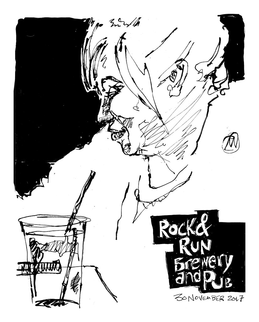
The act of capturing body language holds a particular interest for me. I like drawing people and I like to establish just enough additional detail to suggest a location, without getting lost in the weeds of unnecessarily sketched out minutiae. Frankly, it can be tough to get a good sketch unless I situate myself someplace where I have a good line of observation of people who are moving around a lot. The Rock & Run Brewery and Pub, located on our town square and perhaps only a twenty minute walk from the house, is such a place and I’ve taken advantage of the welcoming sketch environment on several occasions. The challenge for me is to not get distracted by all of the movement, the hustle and bustle, and to focus in on what’s really catching my attention at that moment. Essentially, I feel most successful when I “crop out” the rest of the world and treat my subject as a close up.
In my last post I wrote about the pen I’ve been trying out, a Sailor Fude De Mannen fountain pen. Both of the sketches here were done entirely with that pen, and drawn directly – in other words, no pencil. The solid area of black was filled in with Faber-Castell “Big Brush” marker, which is loaded with India ink. I picked up the Faber-Castell marker a few weekends back when my Pentel Pocket Brush Pen ran dry and I realized I had no extra cartridges with me. I was out of town and to my dismay, the local Michael’s stocked no Pentel products at all, let alone the cartridges I needed. Searching the shelves I came across the Pitt pens and noticed the “Big Brush” model. Figuring what the hell, I paid for the pen and gave it a whirl. And boy, was I happy to have done so! First off, it’s a great fill pen: the nib is large, but comes to a point and makes blocking in against detail very easy. The ink has a ready and generous flow without pooling up. And wonder of wonders – the ink doesn’t bleed through the page like a permanent marker does. It sits on top of the page (It’s India ink, remember?), where it dries without saturating the fibers of the paper.
I continue to enjoy the Sailor pen as well. What I’m coming to realize as I continue to experiment with different drawing tools is that finding “the one” drawing instrument is something of a fool’s errand. But some tools pair together better for my sketching approach than other couplings. For instance, the pairing of a Uni-Ball and a Pentel Pocket Brush Pen has worked very well for my needs. A Varsity Pilot and a loaded water brush are equally great partners, and create a very different look to a sketch made on watercolor paper. Despite the differing stylistic results, I find both pairings of tools to have the right characteristics for me to sketch freely and loosely.
Add to that mix the pairing of the Sailor and Faber-Castell pens I’ve used this week. The Fude tip of the Sailor fountain pen is proving to have a lot of appeal to me, sharing characteristics of both a pen nib and a bouncy brush. And because in order for one to take full advantage of the nib’s properties of line variation, one must be aware of the angle at which the nib is placed on the page, I find myself being a more active participant in the decisions about line weight. With a pen point that has one line weight, it’s too easy to grow complacent and simply rely upon the fluid motions of one’s hand and arm. And while those are important considerations, I know myself well enough to understand that complacency can quickly evolve into a sort of drawing laziness. Actively having to keep my hand angle moving back and forth seems to have a positive effect on line dynamic.
I’ve said it many times before, but it bears constant repeating: Perfection is not the goal of the artist. Evidence of the artist’s hand, along with all of the imperfections that come with it, are of far greater visual interest than a perfectly consistent inked line.
